Duke Energy Corporation is a US electric power holding company with assets in Canada. It is based in Charlotte, North Carolina. The Fortune magazine stated in 2018 that the company owned 58,200 megawatts of base-load and peak generation in the US and employed 29,000 people.
Meaning and history

The Duke Energy logo has gone through multiple updates over its long history. The company’s origins can be traced back to the Catawba Power Company started in 1900. In 1924, the name was changed to Duke Power.
What is Duke Energy?
Duke Energy is the name of a company, engaged in gas and electric power services. Duke Energy was established in 1904, and by today has grown into one of the largest and most reliable providers of energy services in the United States. The company has six subsidiaries across the USA and Puerto Rico.
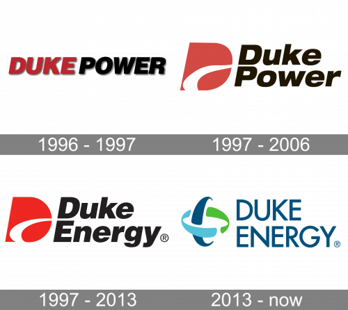
1996 – 1997
A new page in the history of the corporation opened when they decided to merge with the PanEnergy Corporation of Houston, Texas. The respective plans were announced in the fall of 1996. Simultaneously, a new logo was introduced. It was a transitional one.
The logo showcased the lettering “Duke Power” in an unpretentious sans serif typeface. The two words stood very close to each other but the difference in the color helped to create a visual border between them.
The type was bold and italicized. All the glyphs were capitalized. You could see subtle gray shades behind the letters, which helped to add some depth.
1997 – 2006
When the merger was finished, a new visual brand identity was introduced. It reflected the new name.
The Duke Energy logo now featured a new emblem. It was formed by a large “D” in red. Instead of the usual gap, the “D” had a white swoosh positioned lower and joined with the border of the letter. The swoosh looked very dynamic, while its shape directed the gaze to the wordmark.
In its turn, the wordmark featured an italicized and bold sans serif typeface. It looked pretty much like the one in the previous wordmark except that the letters were lowercase (except the initials).
We should also mention that after the merger, the brand Duke Power was preserved but it was used for Duke Energy’s electric utility subsidiary. The subsidiary did not use the old Duke Power logo. Instead, it adopted an emblem of the same structure as that of its parent company. There was the red “D” with the swoosh. The lettering “Duke Power” featured the same type and color as the main logo.
1997 – 2013
In 1997 the Duke Power company was renamed Duke Energy, and the logo was changed accordingly. The badge featured the same structure and style, as the previous one, just had its logotype rewritten with the new name, keeping the typeface and color of the slanted bold letters. As for the emblem, it also remained unchanged, just got its muted red enhanced, so now it boasted a bright scarlet shade of a powerful color, with the white line over a stylized capital “D” refined and shortened.
2013 – Today
The visual brand identity went through a complete overhaul. This was partly due to the merger with Progress Energy Inc., which took place in the summer of 2012. The new logo looked more like the Progress energy emblem than the old Duke Energy logo. Yet, the desire to create a unified brand identity wasn’t the only reason for the update – they also needed a more modern and eco-friendly design.
Firstly, the emblem grew lighter (no black, thin strokes) and more dynamic (due to the rounded swooshes).
What’s even more important, the updated design started to look more “ecological” reflecting the company’s need for a new image. This effect was partly due to the new palette. The aggressive combination of red and black was replaced by the colors traditionally associated with nature – the blue of the water and the sky, the green of the leaves. Even the irregular, curvy shape of the emblem resembled natural forms rather than a manmade object.
Font and color
The clean and distinctive uppercase logotype from the primary version of the Duke Energy badge is set in a modern sans-serif typeface, which is pretty close to such fonts as Futura Classic Normal and LTC Twentieth Century Medium Small Caps. The characters feature full-shape contours and confident lines with straight cuts.
As for the color palette of the Duke Energy visual identity, it is based on a combination of green and blue elements, drawn against a white background. Green here stands for the source of energy and life, while blue points to the professionalism, reliability, and trustworthiness of the company.


