Dollar Tree is the name of the retail company from the United States, which was established in 1986. Today the company has more than 15 thousand variety stores across North America, offering grocery and houseware products, along with health and personal care items, at very low prices.
Meaning and history
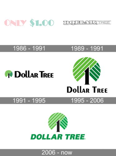
The company, which today is known as Dollar Tree, was founded under the name “Only $1” and offered goods for only that price. The name was changed in 1991, so for the first five years, the visual identity of the American retailer was completely different from what we all can see today.
What is Dollar Tree?
Dollar Tree is an American chain of discount stores, which was established in 1986. Today, Dollar Tree, which includes its namesake brand as well as Family Dollar and Dollar Tree Canada, has more than 15 thousand stores in North America. The chain offers a variety of discounted products, from stationery to household chemicals.
1986 – 1991
The original logo for “Only $1” was not even a logo, but a simple neon banner with the store name placed in one line and executed in pink and green bold sans-serif. The only unique detail of the logotype was a small graphical element between the two parts of the inscription. It was composed of three stylized arrows, pointing to the right.
1989 – 1991
A logo with a name that we all recognize today appeared back in 1989. It had “Dollar Tree” printed using two different words. The first word had serifs and a three-dimensional shape and appeared to be looked at from the bottom. The “Tree” portion was also printed using all uppercase letters, but they were written using thin strokes and placed on a rectangular background with a thin line going across the top and bottom of it. The logo was predominantly white with black outlines, which made it hard to see on some backgrounds.
1991 – 1995
The new concept was brought to the retailer’s visual identity in 1991. It was a prototype of today’s logo, composed of a stylized green tree with the black “1” as the tree’s trunk. The smooth and stylish “Dollar Tree” inscription was also executed in black and placed under the emblem. The tree itself was drawn geometrically and used two different shades of green, which made it look brighter and more vivid.
As for the wordmark, written in a smooth sans-serif, it represented the professionalism and the progressive approach of the company, along with its reliability and loyalty.
1995 – 2006
Although the updated version featured all the elements of the previous logo, it had a completely different feel. The green tree was enlarged and centered above the name. This approach created a more balanced brand image and added more color as there was now a more lively green. A less noticeable change was done to the inscription itself. All the letters were spaced further apart, creating a more solid base for the tree above.
2006 – Today
The redesign of 2006 was mainly about the logotype. The emblem was only slightly refined, keeping the original tree style and its colors. As for the next part, it is now written in green, which repeats the darker shade of the emblem. The typeface has also been changed — the new geometric sans-serif of the italicized inscription in bold strong lines looks confident and solid.
The Dollar Tree logo is a representation of a reputable company, which grows in order to fulfill all the wishes of its customers. It reflects the company’s values of quality it y and its dedication to making the goods affordable.
Font and Color
The wordmark from the Dollar Tree logo is set in a pretty simple yet solid sans-serif typeface with traditional contours of the letters. The only designer thing here is a slight inclination of the lettering, which makes it look a bit more friendly and welcoming. The italicized uppercase inscription is set in a font very similar to iconic Helvetica, or such types as Boring Sans A Heavy Italic and Oddlini Ex Black Se Condensed Ut Obli.
The color palette of the Dollar Tree visual identity is no surprise either. It is based on the three shades of green, with one element colored in black. Apart from being the color behind the dollar bill, green also stands for wealth and prosperity, new life, and growth.


