DisneyToon Studios was a division of the Disney Company that specialized in traditional animation and sequels to classic Disney cartoons. It existed for almost thirty years and was closed in June 2018.
Meaning and history
In thirty years of existence, DisneyToon Studios has managed to produce more than 60 cartoons, including sequels to The Lion King, Pocahontas, Lady, and the Tramp, cartoons “Fairies” and “Planes”, which were loved by younger audiences, as well as many others.
After a management change and takeover in 2006, it was decided to wind down some of DisneyToon’s projects, including “Aristocrat Cats II,” “Pinocchio II” and “Dumbo II,” and now the division is closing down entirely.
DisneyToon employees have spent the last few years developing a series of animated films called “Fairies,” which started back in 2008 with the Tinker Bell picture. The last part, on which the studio worked – “Fairies: Legend of the Beast” – was released in 2014 immediately at the home video box office.
The decision to close DisneyToon Studios was made because of the decline in revenues from DVD and Blu-ray sales, on which, mainly, DisneyToon Studios cartoons were released.
What is DisneyToon Studios?
DisneyToon Studios was the name of a division of Disney that was founded in 1990 as Disney MovieToons, and renamed in 2003. The studio specialized in traditional animation and was primarily involved in creating sequels to the studio’s existing classic animated films, until its closure in 2018.
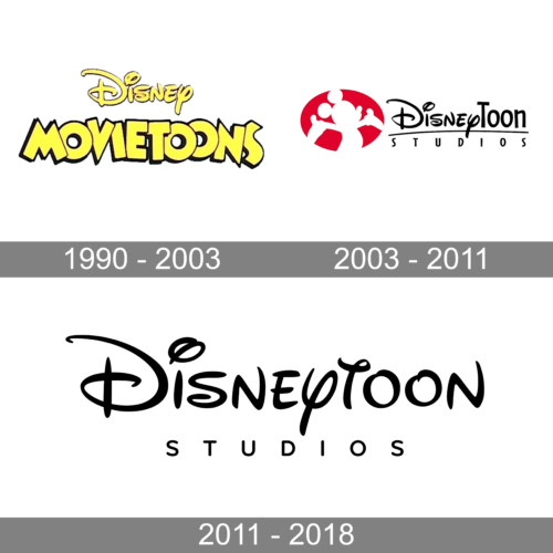
In terms of visual identity, the history of the DisneyToon Studios logo can be divided into two periods: the early one, when the company was established under the name Disney MoovieToons, and the later one, which started with the renaming of the studio in 2003.
1990 – 2003
The logo, created for Disney MovieToons in 1990, stayed unchanged for more than a decade. It was a bright yellow badge, composed of two wordmarks, placed on a plain white background. The top level contained an iconic Disney logotype in a bold corporate style, with each character outlined in black. As for the bottom line of the logo, it was a bold uppercase “MovieToons” inscription in a geometric sans-serif typeface, with the letters overlapping.
2003 – 2011
In 2003 the division was renamed DisneyToons Studios and the logo was changed accordingly. The new badge was set in a black and red color palette, with the graphical emblem placed on the left from the two-leveled black inscription. The emblem depicted a white silhouette of Mickey Mouse, drawn on a solid red horizontally oriented oval. As for the lettering part, it was set in two styles — with the “Disney” in its corporate type, and “Toon” in a bold sans-serif.
2011 – 2018
The redesign of 2011 has simplified the composition of the logo, removing its bright graphical part, and the black stroke, which separated the two levels of the inscription. Both parts of the logotype were enlarged, and the contours of the characters were cleaned up. It was a stylish minimalistic badge, which stayed with the company until its closure in 2018.
Font and color
The black lettering from the DisneyToon Studios badge used two styles of typeface — the top line was set in a familiar Disney font, while the “Studios” tagline was executed in a clean modern sans-serif typeface.
As for the color palette of the DisneyToon Studios visual identity, it was based on the most laconic and strict combination of black and white, which makes the logo look progressive and always actual, and points to the professionalism and excellence of the company.


