Dinamo Zagreb is the name of a professional football club from Croatia, which was established in 1945, right after World War II, when the Communist government of the country decided to merge three clubs — HASK, Concordia, and Gradjanski — in one, with the new name, Dinamo.
Meaning and history
The Croatian club Dinamo Zagreb was founded in 1945 as the result of a merger of three clubs — Concordia, Gradjanski, and HASK. After two seasons in the championship of Yugoslavia, Dinamo Zagreb became the winner. Overall it won the title four times.
After the collapse of Yugoslavia Dinamo took part in the first Croatian championship. The management tried to distance themselves from the communist past and was constantly changing the club’s name. However, the fans did not accept the experiments and after 8 years the club regained its historic name.
FC Dinamo Zagreb has its nickname, “The Blues”, as they usually play in a bright blue uniform. The club’s team plays home matches at the Maksimir stadium, which has a capacity of 38 thousand seats.
What is Dinamo Zagreb?
Dinamo Zagreb is the strongest and the most popular professional football club in Croatia, which was formed in 1945 as a result of a merger of three clubs. The club, also known as “The Blues”, is based in Zagreb, the capital of Croatia, today Dinamo Zagreb is ranked 33 in UEFA.
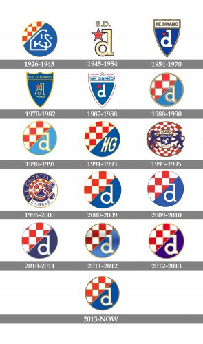
As for the visual identity, Dinamo Zagreb can definitely compete for the leading position in the list of the world’s football clubs with the largest amount of logo redesigns. Although most of the logos are just refined versions of one circular emblem, there is always a series of crest-like badges, used by the club from the 1950s to the 1980s.
1926 — 1945
The very first badge was used by the predecessor of the club, from 1926 to the official foundation of Dinamo Zagreb in 1945. It was a circular medallion, with a solid blue background and a small cut-out fragment, separated from it diagonally on the upper left part, with a white background and a pattern of rhombuses in red with a yellow outline. The blue part of the badge comprised a stylized monogram, written in bold white lines.
1945 — 1954
The first official Dinamo badge was introduced in 1945 and looked pretty simple yet bright and fresh. It was a stylized lowercase letter “D” with the white body outlined in yellow and blue, and accompanied by a solid red five-pointed star with the same outline, but thinner. The star was glued to the left part of the letter, and complemented by the “S. D.” lettering in yellow and blue, set above the emblem.
1954 — 1970
The redesign of 1954 refined the lowercase “D”, shortening its serifs and making them more square. The letter was now set in plain white and placed on a solid blue crest, in a golden outline, with the white banner on top. The banner comprised an uppercase “NK Dinamo” inscription in gold outlined letters. The narrowed bold font of the logotype made the classic shape of the logo look more modern and strong. As for the five-pointed star, it was also here, drawn in solid red, and outlined in black, placed on the left from the letter.
1970 — 1982
All the white elements became blue on the logo, created in 1970. The “D” was now outlined in yellow, as well as the badge itself. As for the upper part of the logo, it also has a blue background, and the lettering written over it was executed in medium-weight yellow sans-serif capitals. The red star became larger and was also outlined in yellow, which made it more visible and bright.
1982 — 1988
The color palette of the Dinamo Zagreb badge was changed to blue, white, and red in 1982, with the blue crest in a thick white outline, the letter in solid white, and the upper banner with the wordmark too. The logo was outlined in red, with the inner framing of the banner on the top in blue. The red star moved a bit higher and got its outline removed. Overall, the logo looked very stylish and professional. That was the last logo in the shape of the crest, designed for Dinamo Zagreb.
1988 — 1990
The first circular medallion was introduced in 1988 and featured the color palette of the very old logo from 1926. The roundel, outlined in gold, had its body diagonally separated into two parts: the upper one with a white background and a pattern of red rhombuses outlined in gold, while the bottom part was colored blue, and had a white lowercase “D” in a thick gold outline, with a tiny golden five-pointed star on it.
1990 — 1991
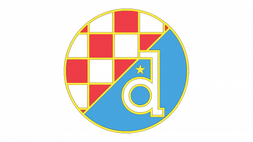
Two years later the contours of the badge were refined and the calm gold shade was replaced by a bright yellow. The blue and red elements of the badge also got lightened up, which made the whole logo look fresher. The outline of the “D” became more elegant, and the tiny yellow star was slightly enlarged.
1991 — 1993
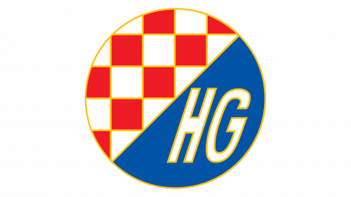
After the historical events that led to the breakup of Yugoslavia, the name of the soccer club was changed to HASK Gradjanski, so the logo had to be changed as well. Apart from the letter “D” replaced by the uppercase italicized “HG”, there were other changes. First of all, the star was gone from the logo. Secondly, the color palette got intensified, with the shades of blue and red becoming darker and deeper.
1993 — 1995
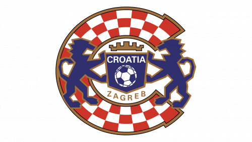
Another name experiment led to another logo. It was a rounded badge, composed of an extra-thick stylized “C”, with a white and red checkered palette, in a golden outline. The two blue rampant lions, overlapping the letter, were holding a solid blue crest, which was set in the very middle of the “C”. The crest was decorated by the arched golden crown on top, and a white and blue Football ball in the center. Above the ball, the white “Croatia” in all capitals was set, while the gold “Zagreb” lettering was arched under it. The new name of the club was Croatia Zagreb.
1995 — 2000
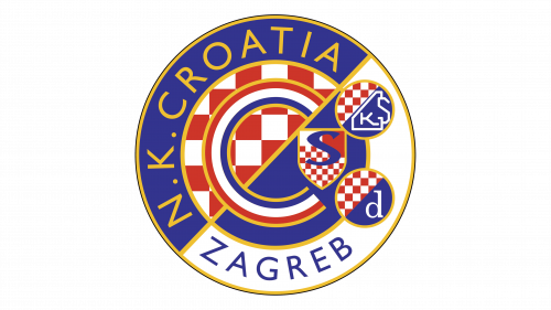
The logo was modernized in 1995, with the “C” now drawn in a red, white, and blue tricolor, outlined in yellow and placed over a circle, diagonally divided into red and white, and blue halves. The circle was outlined in a blue and white frame, with the inscription written around its perimeter in a modern and clean sans-serif typeface. The right part of the badge was decorated by three smaller air cleaners in the same color palette, but with three different symbols, representing the three football clubs that merged to form a new one.
2000 — 2009
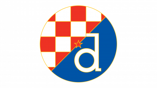
Due to the efforts of the club’s fans, the team was renamed back to Dinamo Zagreb in 2000, and the iconic circular logo followed. The rhombuses on the left part were enlarged, with the yellow outline so thin, that barely noticeable. As for the blue half of the badge, it became brighter than before, with the white lowercase “D” in a delicate yellow outline. The red five-pointed star was now placed on the diagonal line, separating one part from another.
2009 — 2010
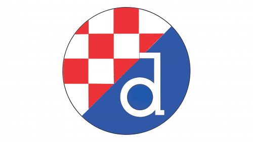
All yellow details were removed from the Dinamo Zagreb badge in 2009. The star was also gone, so now the logo was quite minimalistic and clean, which evoked a sense of professionalism and dedication, responsibility, and loyalty. It was the simplest and the most laconic badge of all but only stayed with the club for a few months.
2010 — 2011
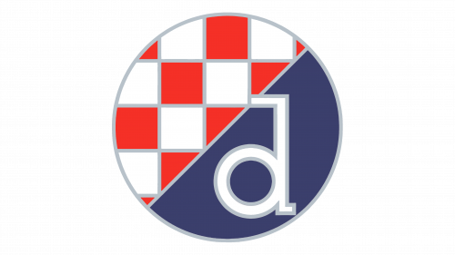
With the redesign of 2010, the contours of all elements on the badge got a new bold outline — silver-gray. The color palette was also balanced, with the shade of red getting lighter, and blue — calmer and darker. The new palette made the badge more modern and sleek, although this version of the badge didn’t stay for long either, and the Dinamo Zagreb badge was redesigned again just a few months later.
2011 — 2012
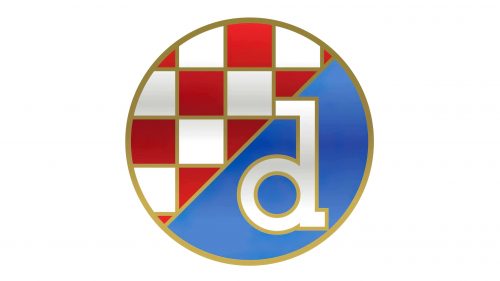
The color palette of the Dinamo Zagreb logo got changed again, with the blue getting light gradient shades, and red — darker ones. The gray outline was replaced by the gold one, which made the emblem look pretty fancy and glossy. The badge stayed with the club for another season and was changed to a new one in 2012.
2012 — 2013
The redesign of 2012 made the Dinamo Zagreb logo flat again. The main colors of the badge got brighter and more intense, with the golden outlines becoming softer and lighter. The badge of the football club looked bright and could be placed on any background without losing its visibility and uniqueness.
2013 — Today
The contours of the lowercase “D” were refined, and the color palette of the Dinamo Zagreb badge was switched again in 2013. The golden lines became darker, creating a stronger contrast between the elements, while the letter, which became thinner and more delicate, balanced the strength of the contours, adding elegance and timelessness to the logos


