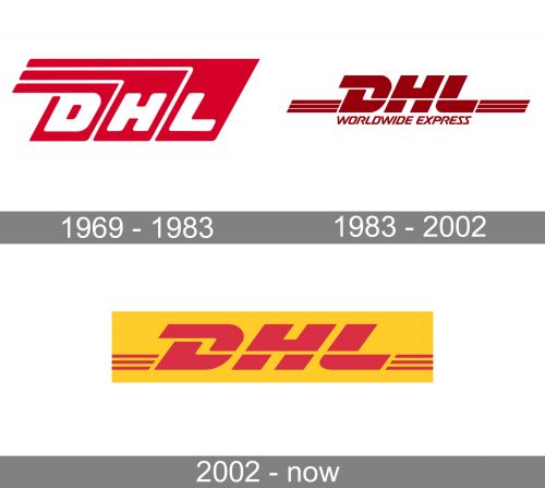
The DHL logo hasn’t changed that much over its more than 50-year history. And yet, although it has preserved its basic structure and style, there’s still certainly been an evolution regarding the color scheme and the design of the elements.
Meaning and history
While the company was established in 1969, its roots can be traced back to the early 1960s. For the company co-founder Larry Hillblom, it all started as a job of a courier he did when studying at university. After he graduated, he started DHL together with two co-founders.
Today, DHL is a division of the Deutsche Post AG and is considered the world’s largest logistics company operating around the world. It earns about €1.5 billion annually.
1969 – 2002
The very structure of the logo has always remained pretty consistent. The letters “DHL” have been bold to make them better legible and italicized to add some dynamism. Also, there’ve always been additional elements to create a sense of speed.
On the original logo (1969), the company name was white, while the background was bright red. Each letter was separated by a white line.
1983 – 2002
In 1983, the company started its intra-US expansion , which coincided with the introduction of a new logotype. This time, the color grew calmer: the bright red was replaced by a muted darker shade. Also, the color scheme was inverted: the letters were now dark, while the background was white. There’s every possibility that this move was supposed to make the logo better legible without the need to spend so much paint.
In addition to the colors, the designers also slightly altered the shape of the letters introducing the iconic “D” with an elongated top. All the letters now consisted of two parts. The three stripes on both sides helped to create a sense of motion. Also, as the brand was to be introduced to more and more new customers, the lettering “Worldwide Express” became part of the logo, which was to explain the company’s business to those unfamiliar with the DHL abbreviation.
2002 – Today
By 2002, the company was purchased by Deutsche Post and became its division called Express. The ownership change was reflected in the introduction of an updated look, which was developed by Nitsch Design.
Font
The highly customized letters appear to be based on typefaces from the Frutiger and Minion families.
Colors
The bright yellow and red featured on the DHL logo are close to Pantone 116 and Pantone 200.


