Del Monte is an American food brand, which was established in 1886. Today the company is one of the largest players on the USA market of canned and processed food production and distribution and also exports its goods to Asian and African countries.
Meaning and history
Del Monte is the own brand of Del Monte Food Inc, a huge American company with annual sales of almost 2 billion USD. The portfolios of Del Monte Goods are really impressive. It includes such labels as S&W, Contadina, College Inn, Fruit Burst, Fruit Naturals, Orchard Select, and SunFresh. But still, Del Monte is the leading brand of the corporation.
The label is the world’s leading producer and supplier of canned fruits and vegetables, juices, beverages, snacks, and desserts. The Del Monte canned products can be found in supermarkets in Europe, the Middle East, and Africa
What is Del Monte?
Del Monte is the name of an American food company, which was established in the middle of the 1880s, and today its products are distributed all over the globe. The company is mostly known for its canned food products, which are based on natural ingredients.
1892 – 1909
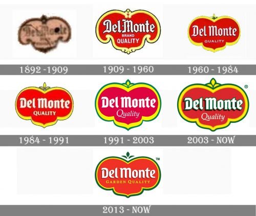
The Del Monte brand has a rich visual identity history. The first logo of the company was designed in 1892 and comprised an ornate shield with a handwritten wordmark in cursive. This elegant logo stayed with the brand for almost twenty years and was changed in 1909 to a colorful version.
1909 – 1960
The red and yellow color palette of the 1909 Del Monte logo is still in use today, just the deep green is added. The shield was modernized again in 1960 and its refined shape is the one we all can see today.
Resembling a tomato, red Del Monte emblem has a thick yellow outline and is placed on a green background.
The lettering in white features an old-style typeface with a gothic feel, with looks smoother due to the green outline and shadow. The tagline “Quality” is written in a thin white cursive.
1960 – 1984
The redesign of 1960 refined the contours of an elegant gothic badge, making it look more like a tomato. The lettering was also a bit refreshed, getting their lines thicker and more confident. The red badge in a thick yellow outline was now placed in a solid green background, which looked sleek and powerful.
1984 – 1991
In 1984 the red badge was used mainly without green background, being placed directly on the product’s packaging, which varied. The “Quality” tagline was executed in bolder white lines and gained a more elegant typeface, resembling the one from the main part of the inscription.
1991 – 2003
The contours of the Del Monte badge were strengthened and cleaned in 1991. The red medallion with a yellow frame gained a thin green outline, resembling the green background from the earlier versions. The lettering was cleaned and emboldened, with the tagline written in a new elegant cursive.
2003 – present
2013 – present
The “Del Monte” logotype gained a confident green outline in 2003. Now the inscription was shadowed and evokes a sense of movement and dynamics, making the whole badge look more vivid and modern.
Font and color
The Del Monte logotype is executed in two different styles: the bold gothic lettering for the main part, and the thin and delicate cursive serif font for the tagline. The upper part is written in a font, which is close to Varna Regular and Holistically Bold fonts, but with the contours modified. As for the “Garden Quality” in all capitals, its font resembles FF Absara Pro Bold SC.
The color palette of the Del Monte visual identity is based on red, yellow, and green intense shades and white for the main lettering. This combination makes the badge eye-catching and memorable, and evokes a sense of power, professionalism, and confidence, while the white accent adds a touch of loyalty and reliability.


