Deep Purple is an iconic British band, which was created in 1968. The band’s musical style changed a lot during its history, and they were successful in both heavy metal and hard rock. Deep Purple sold more than a hundred million albums worldwide.
Meaning and history
 Deep Purple got its name due to the favorite song of one of the musician’s grandmother. At the beginning of its history, the band was called Roundabout.
1968

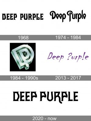
The very first logo for the iconic band was designed in 1968 and featured a stylized black wordmark set in the uppercase, with its bold and slightly narrowed letters executed in a custom unique typeface with the ends of the lines elongated and curved. It was a very memorable and recognizable badge, which has a little resemblance to the logo we all can see today.
1974 — 1984

The redesign of 1974 brought a new style to the Deep Purple inscription. It was still written in black, but now in a title case, and the typeface got smoother and cleaner. The main elements of the new identity were the first letters of both words, “D” and “P” with their arched “hats”.
1984 — 1990s

In 1984 a three-dimensional version of the band’s logo sees the light. It was a gradient silver monogram where two letters, “D” and “P”, were written in sans-serif and placed one inside another, with the vertical pattern of “P” coming out of the “D” into the bottom part. The logo was placed on a black background, and its glossy silver surface created a great contrast of colors and textures.
2013 — 2017

The next version of the Deep Purple logo was introduced in 2013 and it was the first wordmark, executed in purple color. The handwritten lettering had uneven smooth lines with thin ends and looked stylish and interesting, with the “P” replaced by the question mark, and the “L” with the exclamation sign.
2020 — Today

In 2020 the band decided to come back to its roots and creates a logo basing on the original version, from 1968. The new logotype is set in black capitals and has its letters written in smooth curvy lines, which do not look feminine, but stylish and unique.


