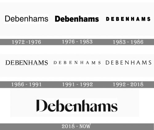
Debenhams is a multinational retailer based in the UK. While the history of the company isn’t very long, the Debenhams logo has gone through multiple modifications.
Meaning and history
1972
The original logo, similar to the majority of the following versions, showcased only the name of the brand without any pictorial additions.
The designers opted for a clean and legible, yet generic sans serif typeface. Only the initial was capitalized.
1976
The type grew bolder. It also adopted a couple of slightly unusual details (the shortened ends of the “e’s,” for instance).
1983
The lowercase letters were replaced by the uppercase ones, which provided better legibility. The type was still bold and rather generic.
1986
The designers, eventually, developed unique typography. The unusual touch was created by the multiple white gaps present on all the letters (the number of the gaps in each glyph varied from two to four).
As for the font, it was still rather unpretentious. In contrast with the previous one, it was a light sans serif font.
Also, the company used an alternative version that featured a colorful “D” icon.
1991
The type remained the same but the space between the letters grew more generous. As a result, the design grew lighter. During this year, the company apparently did not use the full-color “D” icon.
1992
The wordmark lost the decorative gaps, while the serifs grew by far smaller – they were barely noticeable.
The full-color “D” emblem existed in at least two versions (a lighter and a darker one).
2018
An elegant wordmark was introduced. It was drawn in a refined script reminiscent of the calligraphic cursive handwriting. You could see how the widths of the glyphs change from hair-thin to thick forming attractive curves.
While some of the letters preserved the serifs characteristic of older fonts, other letters in the Debenhams logo had cut ends (“h,” “b”) looking very modern.


