In addition to the primary Daimler logo, the company often uses the emblem of its most popular subsidiary, Mercedes-Benz. Due to this, Mercedes-Benz’s three-point star is perceived as part of Daimler’s brand identity.
Meaning and history
One of the world’s major manufacturers of cars and trucks, Daimler AG is based in Stuttgart, Germany. The company was created as the result of the merger of Benz & Cie and Daimler Motoren Gesellschaft in 1926.
The company is often referred to as Mercedes. In addition to Mercedes-Benz, it also sells vehicles and components under such brands as Mitsubishi Fuso, Smart, Setra, and Detroit Diesel, to name just a few.
1883 – 1890
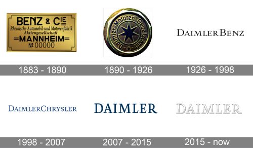
One of the oldest of Daimler’s predecessors, Benz & Cie, was founded in 1883 by three co-founders, Karl Benz among them. The logotype of Benz & Cie was pretty simple: there was nothing but the name of the company in a traditional serif type. The choice of brand identity did not reflect the innovative approach Karl Benz had.
1890 – 1926
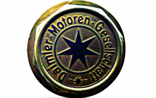
The Daimler emblem, designed in 1890 boasted a solid golden circular badge with the seven-pointed star in the middle. The star was enclosed into a thin circle, which had the “Daimler Motoren Gesellschaft” inscription set around its perimeter in a narrowed sans-serif typeface. Around the lettering, there was another voluminous circular framing in gold.
1926 – 1998
When Daimler Benz was established, it adopted a logo that was pretty similar to that of Benz & Cie. It also featured only the name of the brand. Even the type (an all-cap serif) was the same!
What was different, though, was the size of the glyphs. While in Benz & Cie’s wordmark all the glyphs were of the same height, the 1926 logo contained letters of two heights: the initials were higher, while all the other letters were lower.
1998 – 2007
This logo was in use for more than seven decades until the company adopted a new name, DaimlerChrysler. The overall style of the wordmark preserved pretty much intact, though. The type remained the same as the higher initials did. This time, however, the logo featured a new color: the black was replaced by dark blue.
2007 – 2015
The company’s design team eventually made a concession – the traditional type was replaced with a somewhat more contemporary one. Although the serifs were still there, their sharp ends grew streamlined as, for instance, the top of the “A” did. The type was bolder, too. The right end of the “R” was stretched a little, due to which the glyph adopted a more dynamic look.
In addition to the dark blue logo, there was also a black-and-white one.
2015 – Today
While the shape of the letters has preserved the same, the new color made the Daimler logo look pretty different from its predecessor. The dark blue has been replaced by silver. The white highlights create a 3D effect and add a stylish and dynamic touch.
Additional emblem
The company often uses Mercedes-Benz’s three-pointed star as an additional symbol. For instance, it can be seen at Daimler’s central headquarters in Stuttgart. The star has a long history dating back to a picture postcard Gottlieb Daimler sent to his wife in 1872.
When the company adopted this symbol later, the following explanation was given: the three points of the star represented Daimler’s engines dominating the land, sea, and air.
What is Daimler?
Daimler is the name of one of the oldest luxury automobile manufacturers, which was established in Germany and witnessed the creating of the legendary Mercedes Benz brand. Today Daimler is not just a car marque, but the name of the company, which owns Mercedes and Smart.


