CVS Health, which is based in Woonsocket, Rhode Island, the United States, owns and operates several major brands. The list includes CVS Pharmacy, a retail pharmacy chain, as well as a pharmacy benefits manager CVS Caremark, and Aetna, to name just a few.
Meaning and history
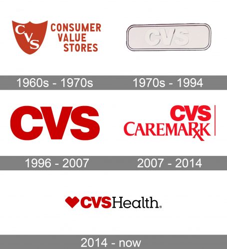
For most of its history, the CVS Health logo featured a bold sans and a lot of red.
1960s – 1970s
One of the earliest logos was based on a shield shape. The shield was dark and large. It was used as a symbol of protection, and thus represented the company’s promise. It was quite natural for CVS to use such symbolism as a pharmacy.
The design featured the letters “CVS” in white. They were positioned diagonally, with the “C” at the top left-hand corner, the “V” in the center, and the “S” in the lower right-hand part.
What is CVS Health
CVS Health is a US healthcare company, which is best known for its CVS Pharmacy chain but also operates several other brands connected with healthcare. It was established in 1963.
1970s – 1994
The company used a more generic horizontal sign based on a rectangle with rounded corners. The rectangle was white with a 3D effect. It housed the name of the brand in a bold sans, which looked rather generic. The letters were visible in spite of being white because they were embossed.
1996 – 2007
The CVS Health logo was simplified, and a bright splash of color was added, which made the design look drastically different.
Gone were the border and the embossed letters. Instead, the name of the brand was given in vivid red glyphs. Their shape, by the way, remained virtually unchanged, but due to the disappearance of the border and the addition of color, the design adopted a different style.
2007 – 2014 (CVS Caremark)
In 2007, the brand merged with Caremark Rx, a pharmacy benefit management company. The new brand was named CVS Caremark Corporation and given a new logo reflecting the updated name.
In addition to the lettering “CVS,” the logo now featured the word “Caremark,” which was placed below and was set in a different typeface. This typeface was by far more unique than the one above. The “R” with an elongated end crisscrossed by a seemingly unnecessary stroke made the logo stand out. The type was also elegant due to the combination of thicker and thinner strokes and refined serifs.
To the right, a vertical line could be seen. We would assume that, as the two rather different parts of the logo were strikingly different in their style, the designers used this line to somehow merge them. The color worked for the same purpose.
2014 – present (CVS Health)
In 2014, the company took a landmark decision pharmacy to take cigarettes out of stores becoming the first pharmacy to do so. To mark this move, they adopted a new name, CVS Health. Accordingly, the logo was updated.
The brand agency Siegel+Gale, which was responsible for the update, preserved part of the brand’s visual heritage. So, the new logo still features the lettering “CVS” in the same (or similar) sans serif font. It is still bright red, although the hue has gone a tad darker.
The abbreviation is followed by the word “Health” in a light serif type. The letters are black.
Last but not least, there is a large red emblem. Technically speaking, it represents the heart, but its shape is somewhat unusual for a heart. So, in fact, we can see a truly unique rendition of a universal symbol.
Colors and font
The vivid red has been a recognizable part of the CVS Health logo for most of its history. Then again, there was some playing around with the hues.
The type used for the word “CVS” has been updated very rarely, but it was combined with other fonts.
Did CVS change its logo?
The CVS Health logo has been changed several times throughout the company’s history, with the very first badge introduced in the 1960s, and redesigned in the 1970s, and the current version of the logo created in 2014, with the geometric heart symbol, which has become the signifier of the company, recognized all over the globe.
Who created the CVS logo?
The iconic CVS Health badge, created in 2014, was designed by Siegel + Gale, a famous design bureau with a rich portfolio, full of dozens of recognizable logos. The small geometric heart with uppercase lettering brilliantly represents the essence and power of the company.
What is the CVS slogan?
The CVD Health slogan is “Health is Everything”, which is literally a mantra for all people on the earth, as this is the thing number one to care about. This slogan was adopted by the company after its rename to CVS Health, in 2014. Before that, the name of the business was “CVS Caremark”.


