CSKA Moscow Logo PNG
CSKA Moscow is the name of one of the most popular Russian football clubs, which was established in 1911 in Moscow. The club, nicknamed Horses (“Koni” in Russian) is considered to be one of the strongest in the Russian Premier League. It is owned by VEB.RF with Yevgeni Ginger as a president, and coached by Viktor Goncharenko.
Meaning and history
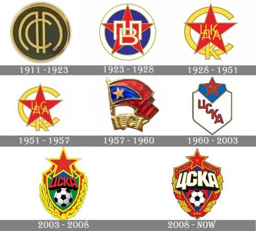
CSKA was established as the sports club of the Russian Army, and all the versions of its visual identity featured a red star as the main element, as it has always been a symbol, synonymous with the Russian military service. Only the very first logo was lacking the star, but during that time, the club was mainly known for skiing, not football.
1911 — 1923
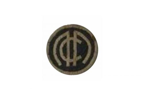
The original logo for CSKA was created in 1911 and was composed of a rounded black badge with a golden outline and a stylized golden monogram in the middle. The lettering was written with the same thickness of the lines as the outline, which made the emblem look balances and modern.
1923 — 1928
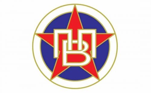
The red star appears on the logo in 1923z it is placed on a blue circle, enclosed in a white frame with a golden outline. The monogram is placed over the star and exe-cuted in the same manner as the framing, but with thinner lines.
1928 — 1951
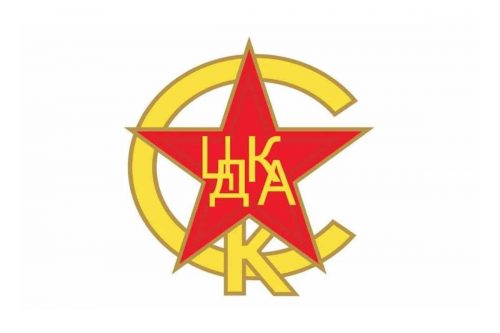
The red star with a yellow monogram on it was placed on a yellow letter “C” and overlapped the “K”, located in the bottom part of the logo. It was a bright and clean badge but it wasn’t balanced well in terms of spaces and thickness of the lines.
1951 — 1957
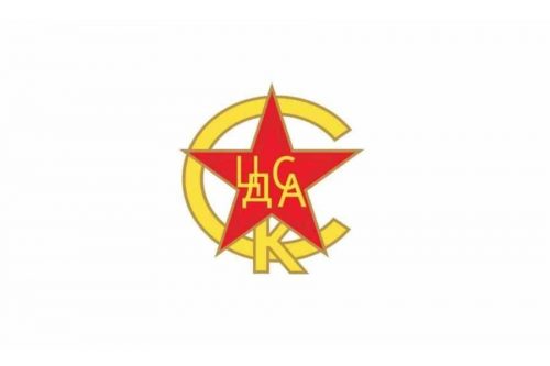
The logo was refined in 1951, the name of the club was changed so one of the letters on the red star was replaced by the new one (“K” was changed for “C”). All the other elements of the visual identity remained untouched.
1957 — 1960
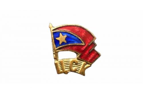
The new emblem was designed in 1957 — it featured a golden arched banner with a wordmark and a blue and red waving flag with a gold star above it. Though this logo stayed with the club for only three years, it was a very elegant version.
1960 — 2003
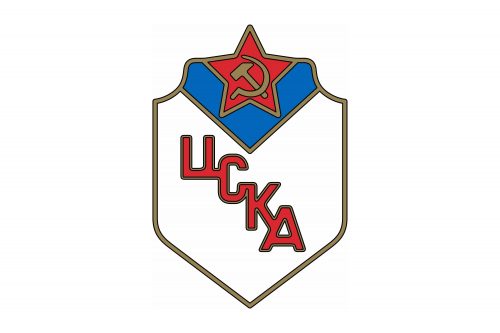
In 1960 the new color is added to the CSKA official palette — white. The white crest with a thick gold outline featured a red star with a golden hammer and a sickle icon on it. The club’s name is executed in red and outlined in gold, located diagonally across the white crest.
2003 — 2008
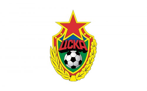
The brightest and the most ornate version of the club’s visual identity was introduced in 2003. It was composed of a traditional shield with an enlarged red star on top. The red and gold framing was accompanied by a gold wreath, composed of two different types of leaves.
The body of the crest was green and blue, standing for the football finals and the sky, and had a red wordmark with a thick black shadow placed above the large football in traditional monochrome.
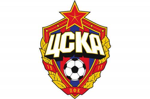
2008 — Today
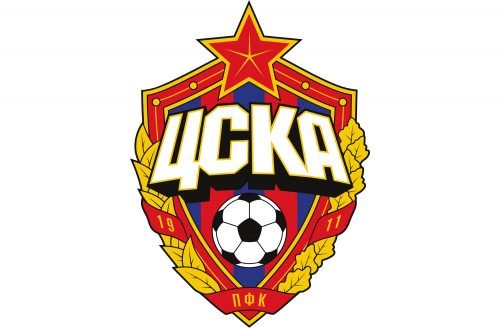
The shield was redesigned again in 2008, keeping the composition of the previous version, but making all the elements more balanced in terms of size. The lettering became white and more massive, while the football is now smaller. The red star also looks more delicate and elegant and the leaf wreaths are complemented by a red ribbon with the datemark on it.


