Crvena Zvezda is the name of a professional football club from Serbia, which was established in 1945. Today the club is considered to be the strongest in its country, holding its rank one in the Serbian SuperLiga. The club is based in Belgrade.
Meaning and history
The Serbian soccer club Crvena Zvezda has a long and complicated history. In 1913 a sports club “Great Serbia” was founded in the capital of the country, the city of Belgrade. However, the following year, due to the outbreak of World War I, the club virtually ceased to exist.
After the end of hostilities and the establishment of the Kingdom of Serbs, Croats, and Slovenes, the “Great Serbia” sports club was restored under a new name – “Yugoslavia”. Twice, in 1924 and 1925, the team became the national champion. After the attack on Yugoslavia in 1941, the team was renamed “SK 1913”, as a tribute to the year the team was founded. After the end of another war, in 1945, the new communist government of the country decided to disband the old team and create a new one on its basis.
And in 1945 the Sports Association of the Yugoslav Youth founded a community called Crvena Zvezda (which translates as the Red Star, the communist symbol number one). Seven sports were represented in the club, and football was one of them.
What is Crvena Zvezda?
Crvena Zvezda is the strongest and most famous professional football club in Serbia, which was officially founded in 1945, but has its roots dating back to 1913. Today the club takes the first line in the Serbian SuperLiga, the highest level of competition in the hierarchy.
As for the visual identity of the Serbian soccer club, there is nothing unexpected in the main element of its logo — the red star. The main symbol of communism, which gave name to the club, has been depicted on each version of the Crvena Zvezda logo, since 1945.
1945 — 1948
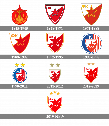
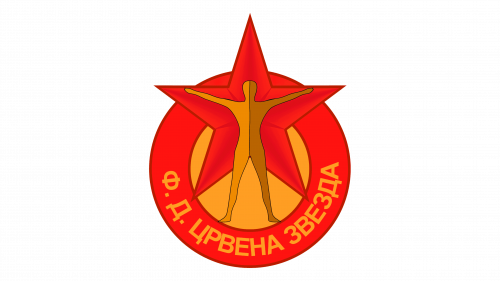
The very first logo of the Crvena Zvezda football club was approved by the Serbian Ministry of Sports in 1946. It was an orange circular badge in a wide red frame, with the Cyrillic lettering in orange, arched along the bottom part of the frame. The enlarged five-pointed star in red was set on the top part of the logo, having its three upper points coming out of the frame. But the star was not the main symbol of the badge, it was just a background for the human figure, depicted in two shades of brown. The human had its arms spread to the sides, repeating the shape of the star. To be fair, this badge was the most interesting and meaningful of all, ever created for the Serbian football club.
1948 — 1971
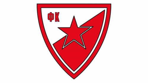
The redesign of 1948 simplified the badge of Crvena Zvezda and made it very usual. It was now a crest in a red and white color palette, with the Jody diagonally divided into two parts. The solid red five-pointed star in a thin black outline was placed in the center of the crest, and the “FC” inscription in Cyrillic letters was set on the upper left corner, in narrowed capitals of an outlined sans-serif. The crest was enclosed into a thick red frame with a black outline.
1971 — 1988
The redesign of 1971 refined the logo of the soccer club, adding some yellow details to it. The thick red frame was replaced by a thin yellow, and the red star gained a bold yellow outline. The Cyrillic letters, standing for “FC”, were also redrawn in yellow and got enlarged, compared to the inscription on the previous version of the logo.
1988 — 1992
The color palette of the Crvena Zvezda club was elevated, and the yellow shade turned orange, while the contours cot cleaner and the lines — straighter. The rounded angles of the elements in the logo from 1971, became sharp and distinct, creating a strong and confident look of the logo. All the black lines of the elements were removed.
1992 — 1995
The badge of the soccer club was redrawn in a white and red color palette again, with the letters turning red, and the star outlined in white. The crest itself got a new frame, composed of red, white, and yellow lines from inside to the outer border. When embroidered on the sleeves of the player’s jerseys, the yellow on the logo turned to gold, which made the badge look sleek and bright.
1995 — 1998
The new concept of the Crvena Zvezda logo design was introduced in 1995. The white and red crest with jo lettering and additional outlines was now placed on a circle, which was vertically divided into two parts: the left in solid blue, and the right with a pattern of vertical stripes in red and white. The white “FK” letters were set on blue background above the crest. The circular badge was outlined in thick white and thin blue. The new concept was a tribute to the national Serbian flag.
1998 — 2011
In 1998 the logo was slightly refined, with two yellow five-pointed stars in a thin blue outline added above the logo to celebrate the 20th win of the club in national leagues. As for the badge itself, it got a bolder blue outline and darker colors. Also, the white lettering on the blue half of the circle was again set in Cyrillic.
2011 — 2012
The circle was gone, and the crest became an independent element again. Although the stars remained, in a new smooth golden shade and with no outline. The crest in white and red also gained a thin golden outline, which was complemented by two more layers of the frame — red and white. The “FC” Cyrillic letters were written in red capitals on the white part of the crest.
2012 — 2019
The two stars above the logo became smaller and moved closer to the crest. Also, the color palette of the badge was brightened up, with the gold getting more yellow, and the red — more vivid and light. As for the composition itself, nothing has changed much, and all elements of the shield remained in their places.
2019 — Today
The shade of red from 2011 came back to the Crvena Zvezda badge in 2019, with the new shade of gold — intense and bright. The same shade was used for the stars above the crest, which were now three, as by 2019 the club won its thirty’s title.


