Credit Suisse is a Swiss finance group, which delivers banking assistance. The company was organized in 1856 and today is considered to be one of the most reputable and influential European banks. Credit Suisse is known for its excellent confidential policy.
Meaning and history

The company’s visual identity is an example of timeless elegance and finesse.
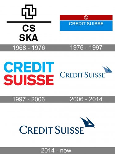
However, the way to the current visual brand identity was rather long – the Credit Suisse logo has gone through at least five modifications over the last 60 years.
1968 – 1976

This version showcases the short name, “CS,” with the lettering “SKA” below. Both the abbreviations feature a simple all-caps sans. Above, there is a dynamic icon based on a combination of rectangles. The wordmark is separated from the icon by a horizontal line.
1976 – 1997

The next version of the Credit Suisse logo resembles a flag. The top, smaller field is red. It houses the same emblem as the previous logo, only now it has a white outline.
Below, there is a wider blue field housing the lettering “Credit Suisse” in white. The type is a light all-caps sans.
1997 – 2006

Only the name of the brand has been left. There is the word “Credit” in blue and the word “Suisse” in red below. The palette is very close to the previous one. The combination of the two words in almost the same colors echoes the flag theme.
2006 – 2014

The logo is composed of a wordmark with an emblem on its left.
The wordmark is performed in a classic typeface with sophisticated lines and pointed angles. The font is similar to TF Arrow. The lettering boasts thin yet confident shapes and is perfectly spaced.
The elegant wordmark is accompanied by a light emblem, which is composed of two sails, one of a lighter time of blue, and the other one — darker. The sails are a symbol of the company’s growth and progress. It was designed in 2006, when the bank combined three of its branches under one roof, and that was the beginning of a new Credit Suisse era.
The royal blue and white color palette of the Credit Suisse logo is a reflection of the loyalty and authority of the company. It shows the bank as trustworthy and experienced, aiming to provide its customers with only the best. The main value of Credit Suisse is confidence and safety, and its logo is a celebration of both these characteristics.
2014 – 2022

The color has grown slightly darker. This added some contrast and made the wordmark easier to read from any distance and irrespective of the amount of light.
The Credit Suisse logo is a timeless classic. It is modest but luxurious, with its sleek lines and a simple yet meaningful emblem.


