M&T Bank is an American financial company, which was established in 1856. Today the bank is one of the Fortune500 listed organizations and has almost 800 operational branches across the country.
Meaning and history
The name of the bank, M&T, stands for “Manufacturers and Traders”, the original name of the company.
Before 2012
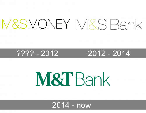
The oldest M&T Bank logo in the list reflects the previous name of the system. It combines the lettering “M&T” in lime green with the lettering “Money” in black. The color is the only border between the two words as there is no space between them.
Also, both the words feature the same type – a very light all-caps sans. The proportions are classic and there are no decorative elements.
2012 – 2014
The word “Money” was replaced by the new name “Bank.” In the word “Bank,” only the initial was capitalized. Also, the number of lime characters was reduced – only the “&” featured the unusual color now.
2014 – Today
M&T Bank has a rich history, that starts in 1856. The company values its heritage and history and is very conservative with the visual identity policy.
The M&T Bank logo is composed of a strict and simple wordmark. The nameplate consists of two parts — the bold “M&T”, executed in a condensed serif typeface with thick lines, and “Bank”, that features a lightweight sans-serif font with clean thin lettering.
The bank uses the “M&T” part of the wordmark as the brand signifier and an icon. In the previous version of the logo, there was a stylized graphical interpretation of these letters, resembling the mountains peaks.
The emerald green and white color palette of the M&T Bank logo is a reflection of the company’s energy and stability. Green also symbolizes balance and harmony, the characteristics that play an important role in the brand’s values system.
It is a simple and traditional logo, which suits the company with such a rich history and a serious approach to the services provided. It is timeless and strong.


