The logo of the US-based manufacturer of arts supplies Crayola has a positive and artistic mood. The design has gone through over ten complete overhauls since 1903.
Meaning and history
The history of Crayola began in 1864 with the processing of coal and the production of pigment based on it, because the founder of the company, Joseph Binney, was engaged in this very business. A new round of development waited for the company in 1900, when it began to produce lead pencils and as a result received a gold medal for them at the exhibition in Paris. In addition, these pencils became very popular with schoolchildren and teachers.
And in 1902 the company released the legendary wax crayons, which replaced the chalk, which crumbled when writing and was a headache for all teachers and students. This invention of the brand was also awarded a gold medal, this time at the World’s Fair in St. Louis.
Enormous demand and the popularity of crayons motivated entrepreneurs to continue in this direction and further develop the line of materials for creativity: so by the 1920s the brand offered special professional pencils for student artists, and also added paints to its range.
In 1949, Crayola launched a 48-color pencil set. The company grew rapidly over the years, including by expanding its range and buying competitor companies, such as Liquitex and Silly Putty.
In 1979, the owners of the company decided to separate Crayola and Liquitex into two separate and independent brands: the first was engaged in products more suitable for children’s creativity, and the second – for professional artists.
Among the hit products invented by Crayola are still wax crayons, as well as erasable markers, pencils and markers that can be written on glass. The assortment of the brand today is quite extensive: many different drawing sets, toys, books, coloring books, scissors, etc.
What is Crayola?
Crayola is an American brand that produces office supplies and products for children’s creativity. The main products are wax crayons. But in addition to wax crayons also produced pencils, markers, magic markers, watercolors, coloring books and other products for creativity. Products of this brand are non-poisonous and safe for use by children.
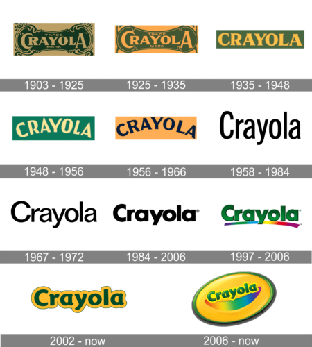
1903 – 1925
The company was established in 1885. By 1903, it already used an intricate logo with plenty of decorative details. The “c” was almost lost (it looked like part of the frame), which made people suppose that the name of the brand was “Rayola.”
Even now, the company still uses the design as a secondary logo.
1925 – 1935
The redesign of 1925 has kept the style of the Crayola badge, but refined its color palette, brightening up the shade of the background to an orange one, and using a slightly intensified shade of green for a stronger contrast. This version of the badge stayed in use by the brand for another ten years.
1935 – 1948
In 1935 the Crayola badge was redesigned, with the composition getting simple and modern. The new badge featured a yellow uppercase lettering in an extra-bold serif font with triangular ends of the bars, set against a solid green rectangular banner, repeating the color palette of the previous version of the logo.
1948 – 1956
The redesign of 1948 has switched the color palette to a brighter one, with the stronger contrast between the shades. The yellow lettering was rewritten in a narrow sans-serif font with more futuristic contours of the uppercase characters, arched against a solid green background. This version of the badge stayed in use by the brand for eight years.
1956 – 1966
In 1956 the Crayola badge gets another redesign, with the contours of the characters refined and extended, and the color palette switched to the o role and orange, where purple was used for the arched inscription, and the smooth shade of orange — for the background.
1958 – 1984
The redesign of 1958 has created a minimalistic strict badge with the black title case inscription in a traditional sans-serif font, written against a plain white background with no decorative elements. This badge was used by the brand until the middle of the 1980s.
1967 – 1972
The Crayola badge, introduced in 1997, featured a voluminous composition with the gradient green lettering in the title case of an extra-bold sans-serif font, underlined by a rainbow line, slightly arched and flared at the right.
The Crayola logo adopted a totally new palette, with the green letters over the yellow background.
The type was a different one. First, the glyphs became more elegant, with their curves and varying widths of the strokes. Also, the lettering “rayola” was lowercase.
1984 – 2006
A simple black-and-white color scheme was adopted. The type was bolder (Futura Bold). This wordmark was easier to reproduce on various surfaces.
1997 – 2006
The design adopted an optimistic and artistic mood. The wordmark was now dark green with gradient and shades adding some volume. A rainbow-colored stroke below embodied the artistic spirit of the brand.
2002 – Today
The heavy, rectangular glyphs were replaced by an elegant type with varying widths of the strokes (Cronos Bold). The green grew darker and more serious. Even the friendly plump “shades” and the yellow color couldn’t return the happy touch of the previous design. This was probably due to the dark hues.
The redesign of 2002 has introduced a bright and stable Crayola badge, composed of a heavy green lettering in the title case of an extra-bold sans-serif font, set on a dark yellow banner, which repeated the contours of the inscription and had a thin green outline, supporting the shade of the logotype.
2006 – Today
This one, on the contrary, is both friendly and optimistic.
For one, the combination of yellow and green has grown lighter and brighter. New colors (rainbow) were added as a symbol of the endless creative possibilities offered by the brand’s products.
Also, a smiling face was used as a background. It was slightly tilted (as if it had been rolling). The typography remained unchanged, but it didn’t look “serious” in any way.
Font
The earliest logos featured serif typefaces, while, in 1930, the era of sans serif fonts started. The current type (Cronos Bold) looks plump and rounded, which creates a friendly impression.
Colors
Yellow and green have been present in the Crayola logo, in one form or another, for much of its history. And yet, the company has experimented with the palette a lot, changing the hues and the proportions, as well as adding various other colors.


