Costa Coffee is a famous chain of coffeehouses, which was established in 1971 in the United Kingdom. Today the company is owned by Coca-Cola Group and has almost 4 thousand locations in more than 30 countries across the globe. The yearly revenue of Costa Coffee is about 1,2 billion GBP.
Meaning and history
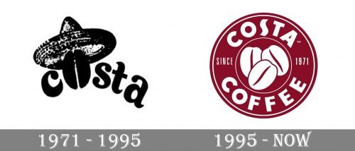
Despite its pretty long history, the famous coffee-chain has had only one logo redesign throughout the years. Both versions have one main thing in common — they are all about coffee, though the original and the last versions of the company’s visual identity are completely different in their style and composition.
1971 – 1995
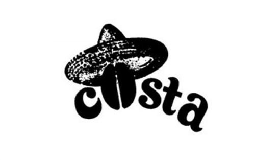
The very first logo for Costa Coffee was introduced in 1971 and composed of a wordmark with a straw hat above it. The whole image was executed in black and usually placed on a white background, though sometimes the color palette was switched to dark brown. The main and element, which made the logo recognizable was the coffee-bean, replacing the letter “O” in “Costa”.
As for the wordmark itself, it was a bold and elegant lowercase inscription executed in a smooth typeface with slightly elongated, curved, and pointed tails of the letters. It looked friendly and inviting.
1995 – Today
In 1995 the logo was completely redesigned and today we all know the iconic rounded badge with a wordmark around its perimeter and a graphical emblem in the middle. The “Costa Coffee” lettering in bold capitals is separated by “Since 1971” lightweight inscription, placed horizontally on the left and right parts of the frame.
Three overlapping coffee-beans with smooth sleek contours are located in the middle of the emblem, being the main graphical part of it.
In some cases, just the “Costa” logotype is used by the brand, and it is usually executed in burgundy and placed on a white background.
Font and color
The “Costa Coffee” wordmark is executed in a bold sans-serif typeface, which is very similar to Lemon Milk Pro Bold, but with the letter “S” modified and slightly stretched vertically.
The whole and burgundy color palette of the company’s visual identity is a reflection of patroon and confidence, evoking a sense of warmth and friendliness and making you feel the smell of coffee.


