Coleman is an American brand of activity clothing and equipment, which was established in 1900 in Chicago. Today the company operates across the country and is specialized in the production and distribution of camping items. The brand sells its products not only through its physical stores but also via the website.
Meaning and history
The visual identity of the American outdoor activities equipment and clothing distributor is bright and memorable. Composed of a modest badge with a wordmark and a delicate emblem, its logo looks professional and strong.
The Coleman logo is a rounded red parallelogram in a white outline with a thin shadow, which adds some Wilbur and makes the badge look three-dimensional. Inside the plate, there is an underlined lettering in an italicized sans-serif typeface and a rounded emblem on its right.
What is Coleman?
Coleman is an American brand of equipment and accessories for tourism and outdoor activities, which was established in the United States in 1901. Today the company, named after its founder, is one of the world’s leaders in its segment, with production facilities aim China and a distribution network worldwide.
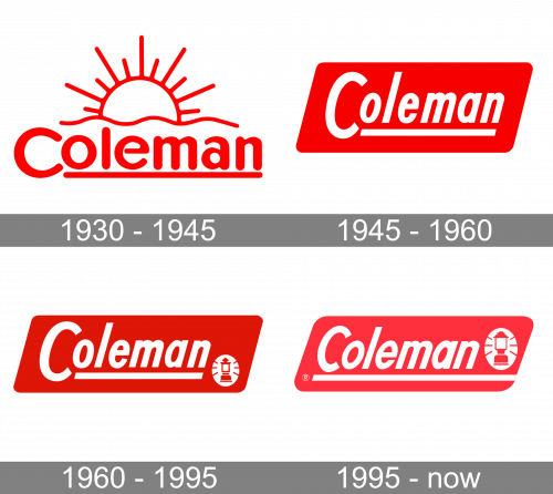
1930 – 1945
The original Coleman logo was designed in 1930 and featured a combination of a rounded sans-serif logotype written in red under a schematic sun emblem, which was also executed in bold softened red lines. The inscription and the whole badge were underlined by a red horizontal, starting under the second letter of the logotype and finishing under the last one.
1945 – 1960
The redesign of 1945 switched the style of the Coleman logotype and wrote it in white over a solid red banner. The new inscription featured an italicized narrowed sans-serif with straight cuts of the lines. The wordmark was also underlined, and the horizontal line combing under it had its ends cut straight too.
1960 – 1995
In 1960 the Coleman badge gets another redesign. The color palette of the badge got intensified, with the red becoming darker and deeper. Another new thing on the logo was a small graphical emblem, drawn in white and placed in the bottom right corner of the banner. It was a roundel with a contoured image of a retro-style flashlight.
1995 – Today
The emblem is composed of a white vertical oval with a red stylized lighter inside. It looks warm and reflects the purpose of the brand and the assortment of its products.
Another bright detail of the logo is a thick white underline, which starts under the letter “C” and merges into the badge’s outline.
The red and white color palette of the Coleman logo is a reflection of passion, and energy, where white accents add a sense of safety and trustworthiness. The simplicity of the badge shows the brand as the one with a fundamental and professional approach, and also represents its value system with their customers in the center.
Font and Color
The friendly white lettering from the primary badge of Coleman is set in a slanted sans-serif typeface with simple and clean contours of the letters. The typeface, used for the title case inscription in the Coleman insignia is pretty close to such fonts as Flaunted Semi Bold Italic and Tawakkal Sans Italic.
As for the color palette of the Coleman visual identity, it is based on a classic combination of red and white, which evokes a sense of energy and power, and shows the company as a progressive and developing one.


