One of the most popular Netflix TV series, Cobra Kai is the brainchild of Josh Heald, Jon Hurwitz, and Hayden Schlossberg. In spite of the fact that it was inspired by The Karate Kid films, Cobra Kai has created its own world and gained a fan base of its own, partly due to the efforts of Ralph Macchio and William Zabka who star in the series.
Meaning and history
While discussing the Cobra Kai logo, we need to distinguish between the wordmark shown at the beginning of the series and the more detailed roundel emblem.
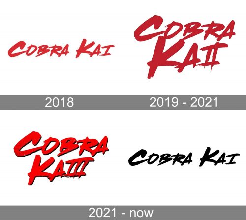
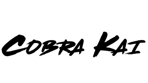
Let’s start with the wordmark. During the first four seasons, the wordmark, which was designed by Geronimo Giovanni, looked pretty much the same. There was only a comparatively small modification for the second season, which was later reversed.
What is Cobra Kai
Cobra Kai has been known as a martial arts comedy-drama streaming TV series, which was first shown on YouTube Red in 2018. Just two years later, Netflix purchased the rights to stream the series.
2018 (season 1)
The design team that created the logo faced one major challenge. On the one hand, the logo wasn’t supposed to have a pictorial part. On the other, it was supposed to create a certain mood and be meaningful. So, the designers had to rely on their imagination to achieve this goal through the typeface only.
The result is a dynamic and stylish wordmark. While it doesn’t say “karate” or even “fighting,” it does send a certain subliminal message that prepares you for what is going to happen in the series.
First, the overall style of the lettering resembles street art – this is how random writing on the wall may look, something written in a hurry, probably in a place, where it is forbidden to write. You can feel the speed of this action in the longer, tilted strokes. More than that, though, this style is about boldness and the desire to leave a mark, which is stronger than the understanding you can be penalized for that.
2019 – 2021 (season 2)
We can hardly say there are any notable changes, except for the letter “I.” In the original version, it had its usual shape, with a single vertical bar. In the second version, another vertical bar was added. As a result, the glyph started to look like the Roman numeral “II” (“the second”). This makes perfect sense, taking into consideration that the wordmark was created for the second season.
On the other hand, this modification didn’t create obstacles to understanding the overall meaning of the word. So, you could still read the name of the series without being confused.
2021 – present (seasons 3-4)
When the third season was introduced, the brand updated the logo. You may think that, have they added another vertical bar to the “I,” they would have made the wordmark cluttered and difficult to understand. How would someone who has never heard of the project know that the “III” is not only “the third” but also just the letter “I”? However, they did use this approach, after all, albeit under very specific circumstances.
This is not to say that this version replaced the original one (with a proper “I”) – it remains the primary Cobra Kai logo.
Roundel
This one is by far more intricate. In the center, there is a cobra with its hood expanded, a sure sign that the creature is ready to attack. It does a great job conveying the aggressive spirit of the series. Sometimes, the cobra appears on its own, while there are also versions, where it is encircled by the club’s motto, “Strike first. Strike hard. No mercy.”
Colors and font
The combination of black and yellow used in the roundel logo is eye-catching and creates an atmosphere of tension. These are the colors of the wasps, so subconsciously we assume they signal danger. Red only reinforces this impression.
The font in the roundel Cobra Kai logo is a generic serif type.


