CNBC is the name of the business tv-channel, which was established in 1989 in the United States. Dedicated to the latest news of the world, the channel specializes in business and economics, being one of the world’s most reliable sources of information.
Meaning and history
Today’s logo of CNBC is bright, unique, and instantly recognizable all over the globe. It was designed in 1996, after three, not such successful attempts, but hasn’t been changed for more than 25 years by now, and it definitely means the company has finally found its individual style, reflecting its values and purpose.
1989 – 1991
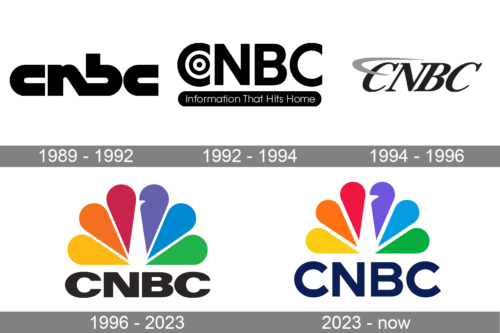
 The original emblem, designed in 1989 was written in the lowercase and had its letters extra bold, with “N” and “B” connected diagonally.
1991 – 1992
 In 1991 the company started writing its logotype in capitals and added a “target” circle inside the first letter “C”, and the “Information That Hots Home” tagline, placed in a black banner under the wordmark.
1992 – 1996
 In 1992 the lettering became italicized and had a light gray orbit or swoosh around the first letter, it was a symbol of progress and speed.
1996 – 2023
The logo from 1996 in the only colorful version, and the one with the strictest and most minimalist nameplate.
The “CNBC” lettering in all capitals is executed in a bold and clean sans-serif typeface, featuring solid black color. It is placed under the emblem, which boasts a stylized drawing of a white peacock with its tail in all the rainbow colors.
Each “petal” or “feather” of the emblem shows the universality of the channel, its ability to work in different directions, its actuality, and professionalism.
Despite being colorful, the CNBC logo looks powerful and confident, perfectly reflecting the purpose of the tv-channel and its fundamental approach to providing their audience with the latest news from all over the globe, in all fields and spheres.
2023 – Today
The logo is to be recognized for its colorful and iconic peacock design, which is associated with a prominent media company known for its television programming and financial market coverage. The logo features a stylized peacock with six feather plumes, each one rendered in a different bright color: red, orange, yellow, green, blue, and purple. These colors are vibrant and arranged in a way that creates a spectrum, resembling the natural spread of a peacock’s tail. Below the rainbow-hued peacock, there is bold, capitalized text spelling out “CNBC,” with the letters presented in a deep navy blue, providing a stark and readable contrast to the multi-colored plumage above. The design is modern and dynamic, symbolizing diversity, vision, and the broad spectrum of content and services offered by the company. The peacock’s forward-looking gaze and the open tail suggest a sense of broadcasting, outreach, and an expansive approach to information dissemination.


