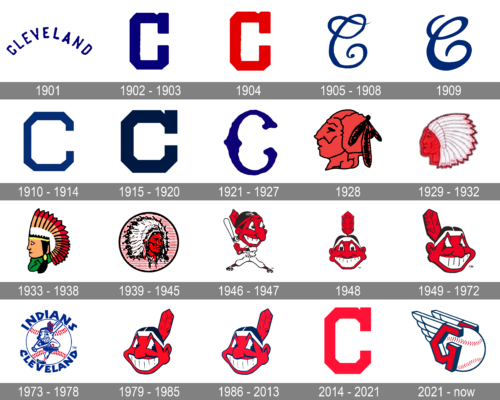
Cleveland Indians have used more than 15 logotypes throughout their more than 115-year history, but in fact, almost all of them have been built around either the capital letter “C” or the Native American theme.
Meaning and history
The baseball club from Cleveland was established at the end of the 19th century as Grand Rapid Rustlers and changed its name only once, in 1901. Unlike the club’s name, the logo of the Indians was redesigned over a dozen times, jumping from minimalistic concepts to more ornate ones.
What are Cleveland Indians?
Cleveland Indians are the name of a professional baseball club from the United States, which was established in 1894, and today competes in Major League Baseball as a member of the Central Division of the American League. The club has Progressive Field in Cleveland as its home arena, and Mike Chernoff as the general manager.
1901
The very first logo for Cleveland Indians, created in 1991, featured a simple arched “Cleveland” inscription in all capitals of a bold handwritten sans-serif typeface. The color palette of the initial emblem was built around the intense and bright shade of blue, which made the simple logo eye-catching and strong.
1902 – 1903
The redesign of 1902 simplified the club’s logo to a single symbol, it was a bold enlarged “C” drawn in blue on a white background. The letter was executed in a custom font with thick lines, geometric contours, and a massive square serif on the upper part.
1904
In 1904 the team was using its logo, designed in 1902, but in a new color palette. The bold “C” was drawn in red, which gave a powerful look to the Indians’ identity and evokes a sense of energy and passion.
1905 – 1908
In the year 1906, the club unveiled a new iteration of the font for the letter “C,” which was adorned with more intricate details and a more ornate design, marking a significant departure from its predecessors.
1909
In 1909 the contours of the logo were modified and the upper tail of the “C” was shortened, which gave a more modern look to the emblem, yet kept the elegance and style of the previous version.
1910 – 1914
The redesign of 1901 brought another “C”, executed in a geometric sans-serif typeface, with the contours of the letter repeating octagonal shape. The lines were thinner than on the logo from 1903, though the badge still looked solid and strong.
1915 – 1920
In 1915 the new logo was introduced by the team and stayed with them for three years. It was again a capital blue “C”, but this time it was written in cursive, with an elongated and curved upper part of the letter, which looked elegant and playful.
1921 – 1927
In 1921 the Indians’ “C” was redrawn again. This time the letter was executed in a wishbone style, with smooth and emboldened ends of the letters. The color palette remained unchanged, the club kept using the combination of blue and white as a representation of professionalism and expertise.
1928
In 1928 a completely new approach to the club’s visual identity was adopted. The new logo for Cleveland Indians featured a red and black profile of a Native American man. He was facing left and had three black feathers in his hair.
1929 – 1932
In 1929 the portrait was redrawn in red and white, with the addition of a large feathery headpiece to the image. The contours of the face were also refined and made more delicate and elegant in comparison to the previous, amateurish version.
1933 – 1938
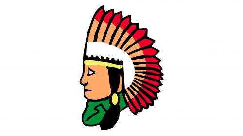
The redesign of 1933 switched the red and white color palette of the emblem into yellow, brown, and red, adding more details to the image and refining the contours of the Native American’s profile.
1939 – 1945
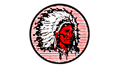
The evolution of the Cleveland Indians’ branding took a notable turn with the introduction of their next logo, which featured a highly detailed depiction of a Native American. This design showcased a figure with a vivid red complexion and a striking black-and-white headdress, set against the backdrop of a circle adorned with red-and-white stripes.
1946 – 1947
A new funny portrait was adopted as the Indians’ logo in 1946. It was a cartoonish smiling face of a Native American man, placed in ¾ and executed in a beige, black, and red color palette with some white details (for the smile and the feather’s top).
1948
This particular logo drew attention for its disproportionate representation of the figure, with a markedly large head juxtaposed against a much smaller body. This stylistic choice rendered the Cleveland Indians’ emblem as somewhat humorous and not to be taken seriously, imbuing it with an air of absurdity. The 1948 version of the emblem, known as Chief Wahoo, presented the character looking directly forward, with the red-faced figure’s head embellished by a single red feather protruding from the black hair.
1949 – 1972
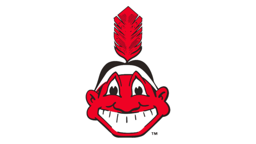
In a bid to refine the emblem further, the year 1949 saw the introduction of several alterations to the design. These adjustments included a reduction in the prominence of the nose and a shift in the head’s orientation to the left. The introduction of triangular eyes and a distinctive toothy grin lent the logo a more pronounced character. The addition of a black outline around the logo further enhanced its distinctiveness. These changes culminated in what would become the most iconic representation of the “Cleveland Indians” logo, a design that remained in use until the year 2014.
1973 – 1978
In 1973 the logo gets another redesign and its color palette is being switched to red, blue, and white, repeating the colors of the national flag of the USA and representing the patriotism and loyalty of the baseball club. As for the portrait itself, it became more modern and fun, and its contours got cleaner and bolder.
1979 – 1985
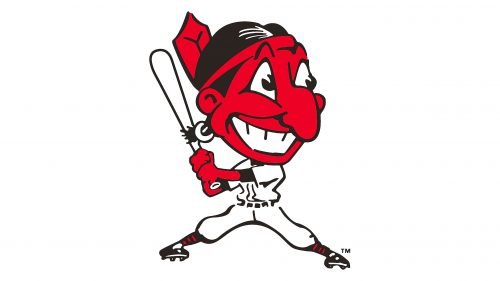
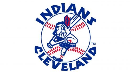
The redesign of 1979 placed the image of the Indian man on a white and blue baseball and added bold lettering around its perimeter. Blue became the main color of the badge, reminding of the very first versions of Cleveland’s club logos. Chief Wahoo on this emblem was wearing a baseball uniform and held a bat in his hand. The inscription in blue was executed in a custom sans-serif typeface with Mayan motives, thick lines, and straight cuts of the letters.
1986 – 2013
The era spanning from 1949 to 1972 saw the “Chief Wahoo” logo undergo a significant transformation, with the revised version making its debut in 1979. This iteration of the logo, which remained consistent until 2013, served dual purposes, functioning both as the team’s official logo and as its mascot, symbolizing the team’s identity in both spirit and imagery.
2014 – 2021
In 2013 the team comes back to its logo version from 1904, a bold geometric “C” in the red and white palette. The contours of the letter are being strengthened and cleaned, and an additional version was created — red “C” on a calm blue background.
2021 – Today
This logo represents the Cleveland Guardians, a name adopted by the baseball team in 2021 as they transitioned from their previous identity as the Cleveland Indians. The design features a bold, stylized letter “G” with a wing attached, embodying both a sense of motion and strength. Rendered in the team’s classic colors of navy blue and red, the logo cleverly incorporates a baseball in the background, with the seams of the ball visible in red. The wing is detailed and feather-like, extending upwards to signify elevation and aspiration. The logo’s modern and sharp angles are a departure from the team’s former branding, reflecting a new era for the franchise while maintaining a connection to the city through the iconography of the Guardians of Traffic statues that stand on Cleveland’s Hope Memorial Bridge.
Font
It is hardly possible to discuss the font, in this case, as the wordmark only includes a single letter. It is probably either custom artwork, or customized glyph from an existing font.
Color
The official colors include red (Hex color: #E31937;), navy blue (#0F223E;), and white (#FFFFFF;). The primary Cleveland Indians logo, which is the Block C, makes use only of two of them – red and white, while the secondary logotype (Chief Wahoo) combines all the three. Some of the colors used in the earlier logos include several shades of red and blue, as well as brown, black, and gold.
Cleveland Indians Colors
NAVY BLUE
PANTONE: PMS 289
HEX COLOR: #0C2340;
RGB: (12,35,64)
CMYK: (100,60,00,56)
RED
PANTONE: PMS 199
HEX COLOR: #E31937;
RGB: (227,25,55)
CMYK: (00,100,65,00)
What is the symbol for the Cleveland Guardians?
The symbol of the Cleveland Guardians. A professional baseball club from the United States was introduced in 2021 and featured a stylized geometric letter “G” in a three-dimensional style, divided into two halves with a baseball between them, and two wings coming out of the letters the emblem represents speed and motion.
What happened to the Indians logo?
The Cleveland Indians badge has undergone many redesigns throughout the years, with most of the versions based on the letter “C” or a depiction of a Native American man. The redesign of 2013 introduced a minimalistic yet powerful badge with the bright red letter “C”, and the image of an Indian man was completely removed from the club’s identity in 2019.


