Citgo is an American petroleum corporation, which was established in 1910 in Oklahoma. The company specializes in both the production and transportation of gas and oil and is a part of Petroleos de Venezuela Group.
Meaning and history
The name of the company, Citgo, was generated by the computer after the company decided to change its original name — Cities Service. It is, probably, one of the most successful naming stories ever.
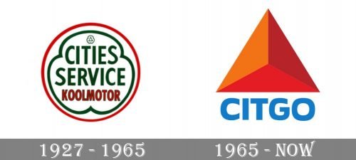
1927 – 1965

The very first badge for Citgo was designed when the company’s name hasn’t been shortened yet. So the white circular badge in a thin red outline has an inner ornate framing in green, repeating the shamrock shape, and the green “Cities Service” lettering in bold uppercase sans-serif set above the red “Koolmotor” in the same style but the smaller size of the letters.
1965 – Today
The Citgo logo is one of the icons of the contemporary visual identity design. It has simple sines and shapes, yet is instantly recognizable all over the world.
The logo is composed of a massive emblem and a wordmark u Der it. The wordmark in a custom sans-serif typeface boasts rounded endless and smooth sleek lines. The “O” looks strong and powerful, perfectly balancing “C” and “G” of the nameplate.
The famous Citgo emblem is a triangle with three sides in different shades of red and orange. The sharpness and bright colors of the symbol make it a progressive and energetic representative of the influential company.
The blue and red color palette of the Citgo logo evokes a sense of innovative approach and reliability, while the white background adds a loyal and safe feeling.


