Enel is a transnational company operating in the sector of the production and distribution of electricity and natural gas. Enel is an abbreviation for “Ente nazionale per l’energia elettrica” which in Italian means State institution for electric power. It was founded as a state-owned enterprise in Italy in 1962. In 1999 in the wake of the liberalization of the Italian electricity market, the company became private with some state participation. By 2014, the company’s year turnover reached the level of almost 76 billion euros and its net income was 772 million euros.
Meaning and history
Enel Group is an Italian energy company that plays an important role in the production of electricity in the world. Today, Enel Group is actively working on projects to increase the share of renewable energy sources and reduce greenhouse gas emissions.
Enel was founded in Italy in 1962, following a meeting of the Chamber of Deputies. It was then that the Italian government presented a bill authorizing the principles and procedures for the creation of Ente Nazionale per l’energia Elettrica (ENEL). According to this bill, the new player was to acquire the assets of all energy-producing, processing, and distributing companies, except for self-producers.
In 1992, Enel was reformatted as a joint stock company and became Enel Spa. The company was privatized in 1999. Today, 23.6% of the share capital is owned by the Italian Ministry of Economy and Finance.
Enel is rightly considered a pioneer in the renewable energy sector. In 2008, the company decided to bet on this very direction, founding the Enel Green Power division, which is still engaged in the development of innovative renewable energy sources.
What is Enel?
Enel is the name of the largest energy company in Europe with more than 86 GW of installed electric capacity, including 46.4 GW of renewable energy. Excluding China, Enel is the largest operator in the renewable energy sector in the world. The company operates in 34 countries on five continents and provides more than 70 million people with energy.
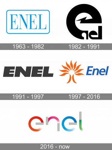
1963
The original Enel logo featured the word “Enel” in a light serif type. The wordmark was placed inside a rectangle with rounded corners. The logo was light blue on the white background.
1982
This version was by far more energetic and powerful due to the lightning bolt shape and the bold “e.” Yet, it was barely legible. You would have never guessed what the company name was unless you had already known it.
1991

This version resolved the legibility issue but did not preserve the originality of its predecessor. The word “Enel” now featured a generic sans. It was bold and italicized, which supposed power and dynamism.
1997
The design was redrawn from scratch once again. This time, it was more meaningful. The orange emblem to the right represented the electric light and was somewhat reminiscent of the light bulb. The blue color of the “Enel” wordmark was inspired by the color of the natural gas. So, the company managed to combine the two main industries in which it works within a single logo. The only problem was that the two elements did not seem to merge very well.
2016
The new Enel logo was developed by the London office of Wolff Olins. It has borrowed the orange and blue from the previous logo as the symbols of electricity and natural gas. Other than this, the design is totally new.
According to the company’s press release, the key idea to the updated design is “the cursor, an iconic visual symbol that represents Open Power.” As the brand explains, the cursor is in constant motion. It also symbolizes the filament, which is behind the power of a light bulb.
Font and color
The futuristic Enel logo, based on the lettering, is executed in a custom designer typeface with the lowercase sans-serif characters having some of their bars shortened and cut. Each of the letters is drawn in two shades, with light gray straight elements and colorful gradient arched ones.
The color palette of the Enel visual identity consists of solid gray as the basic shade, and gradients of orange, pink, blue and green, which symbolized the types of energy, which the company works with.


