Cinnabon is a brand of American bakery, famous for its cinnamon bun rolls. The company was founded in 1985 and today has over one thousand locations in almost 50 countries across the globe.
Meaning and history
The Cinnabon visual identity has always been a reflection of the brand’s iconic product. The cinnamon roll can be seen in all the versions of the logo, ever created for the label, but it’s execution varies.
1985 – 1994
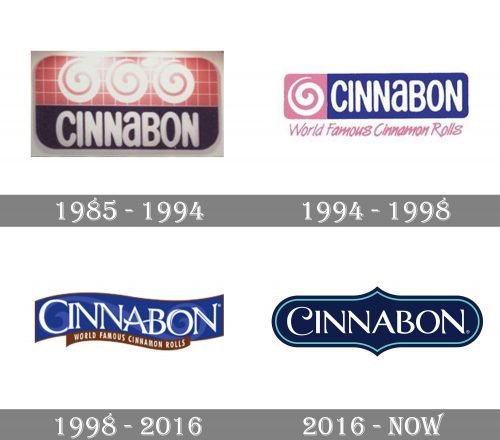
The Cinnabon logo, introduced in 1985, was composed of a horizontal rectangle with rounded angles, horizontally split into two parts — an upper one in pink with a white checkered pattern, and a bottom part in solid blue. Three stylized white rolls were drawn on the top “floor” of the logo, while the bottom was taken by the wordmark. The white inscription in a bold rounded sans-serif balanced the soft and smooth images of the rolls, making the whole logo complete and harmonized.
1994 – 1998
In 1994 the logo was shortened and redrawn in a modern way. The blue, pink, and white color palette remained untouched, but the composition was changed. Now the white swirl emblem was placed on the pink background on the left from the white wordmark, which was set on the intense blue. The banner featured a horizontal rectangular shape with rounded angles, just like on the previous version. The “Worlds Famous Cinnamon Rolls” tagline in pink was added under the banner and used a custom cursive typeface with sharp lines.
1998 – 2016
The logo, designed in 1998, can still be seen in some of the chain’s restaurants across the globe. It is an elegant and stylish blue badge with wavy lines, a white sophisticated inscription, and a brown tagline, which repeats the color of the cinnamon.
The blue banner features a curly ornament, which stands for the curves of the iconic roll-buns. As for the wordmark, it is executed in all capitals of a sleek serif typeface with the first letter enlarged. The “O” of the inscription has its contour slightly open, repeating the shape of the roll.
The tagline in white sand-serif is written inside the thin brown tagline, delicately balancing the logo.
2016 – Today
In 2016 the Cinnabon visual identity was redesigned again. The logo we all can see today features a deep blue badge with smooth lines and sharp peaks, in a double outline. The white wordmark is executed in a custom elegant serif typeface with the first “C” enlarged and its tail curved in order to represent the shape of the roll.


