Cinemex is the name of the cinema theaters chain from Mexico, which was established in 1993. Today it successfully operates all over the country, and also owns several cinemas in the United States.
Meaning and history
Cinemex is the world’s sixth-largest movie theater chain, which was established in Mexico in 1993. Today the company has more than 1800 locations across Mexico and 25 — in the United States.
The original idea of the company was to introduce revolutionary approaches to the film and entertainment industry in Mexico. Cinemex began building multi-screen movie complexes with stadium seating and a primary focus on satisfying every need of movie theater guests. Today, Cinemex continues to offer innovative concepts in the organization of the movie business. Examples include Platino Cinemex and Cinemex Premium, innovative cinemas equipped with luxury seating and a restaurant; Cinemex 3D, a cinema showing 4D films, Casa de Arte and Alternative Content.
What is Cinemex?
Cinemex is an entertainment chain from Mexico, which was established at the beginning of the 1990s. The company owns a chain of movie theaters all over the country and even has several locations in the United States.
1995 – 2009
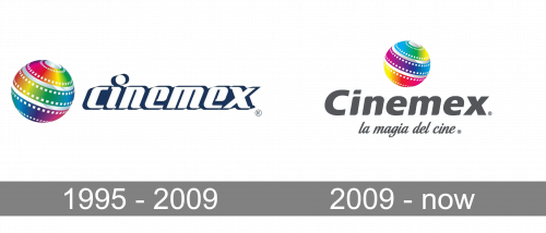
The visual identity of the Mexican cinema chain was introduced in 1995 and only changed once in 2009, keeping the original emblem almost untouched, but adding some modernity to the logotype.
The original version was three-dimensional, composed of a glossy emblem and a white lowercase wordmark with a dark blue outline. The outline had its color diluted with white accents, which made it look voluminous and shiny.
As for the emblem, it was a silver-gray sphere wrapped in celluloid, boasting the rainbow palette. It was a bright and cool representation of cinematography, which made the company stand out and became very recognizable in the region. This is why when Cinemex decided to make a rebranding, they kept the sphere and went for the new logotype.
2009 – Today
The logotype from 2009 is a light gray sans-serif lettering, which is slightly italicized. The font features soft lines and rounded angles, which makes the letter look friendly and elegant. Under the main inscription in the title case, there is a cursive “La Magia Del Cine” tagline, executed in the same gray shade and written in cursive.
The sphere on the new logo is not three-dimensional, due to the replacement of the metallic gray with flat gradient color, but it only looks stronger and more contemporary, evoking a sense of expertise in cinema, design, and style.
Font and Color
The smooth modern lettering from the Cinemex primary badge is set in an italicized sans-serif typeface with softened contours of the massive title case letters. The closest fonts to the one, used in this insignia, are, probably, FF Signa Round Pro Extra Black Italic, or Neue Frutiger And irks Extra Black Italic, but with the contours of the characters softened and slightly modified.
As for the color palette of the Cinemex visual identity, it is based on a bright and gradient combination of rainbow shades, which are used for the globe emblem, representing diversity and endless options. The bright and vivid color scheme of the graphical part is accompanied by dark gray, a color of confidence, professionalism, and stability.


