Cinemark is the name of an American chain of movie theaters, which was established in the middle of the 1980s in Texas, and today has more than 500 locations across the United States and Taiwan.
Meaning and history
Even though the official date of the Cinemark foundation is 1984, the company’s roots can be traced back to the 1960s, when the Mitchell Theaters LLC was established by the Mitchel Brothers. The name of the company was changed to Texas Cinema Corporation in 1972, and the “Cinemark” name first appeared in one of the company’s theaters already in 1977. By the end of the 1970s, the group has owned 25 locations, not only in Texas but also in Utah and California.
Today Cinemark is a large reputable chain of movie theaters with over 500 locations in almost all states of the USA, moreover, the company started its international expansion, opening spots in Taiwan.
What is Cinemark?
Cinemark is one of the largest American movie theater chains, which was founded in 1984, and by today has grown into a huge international company with 521 locations not only in the USA but also in Taiwan.
In terms of visual identity, the metrical chain of movie theaters has been pretty consistent, with just two large redesigns held throughout the years. Moreover, the latest redesign, which took place in 2022, uses the approach of the previous version, with no dramatic changes.
1984 – 1998
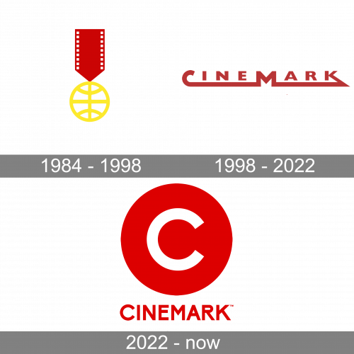
The very first logo for Cinemark was introduced in 1984 and stayed unchanged for a decade. It was a classy traditional emblem, adopted from the Cinemark Corporation, founded in the 1970s. The emblem featured a golden medal on a thick red ribbon. The circular medallion was drawn in yellow contour with three horizontal lines, making up a stylized globe, and a vertical line for the axis. The ribbon of the emblem was stylized as a film, embedded with small white squares along its sides.
1998 – 2022
The redesign of 1998 has completely changed the design concept of the Cinemark visual identity, introducing modern and confident lettering with a graphical icon, which could be used both with the lettering or on its own. It was a sleek extended sans-serif lettering in dark red; with the enlarged and emboldened letters “C”, “M”, and “K”, which were connected with a thick horizontal line underlining the logotype. As for the graphical part of the logo, it boasted a bold white letter “C” in the same typeface, executed on a solid red square, and cutting its borders in the bottom right part.
2022 – Today
In 2022 the Cinemark badge gets another redesign. The red and white color palette from the previous version was kept but brightened and lightened up. The lettering was rewritten in a more laconic geometric sans-serif font with all characters featuring the same size. As for the graphical part of the Cinemark badge, it is still a white capital “C” on a solid red background, but not the shape of the medallion is circular, and the contour of the “C” is standard, with no elongated lines cutting up the background.
Font and color
The clean bold uppercase lettering from the primary Cinemark logo is set in a stable and modern geometric sans-serif typeface with distinctive contours and straight cuts of the bars. The closest fonts to the one, used in this insignia, are, probably, Rock Star Narrow Semi Bold, or Aeonian Bold, but with some visible modifications of the characters.
As for the color palette of the Cinemark visual identity, it is based on a powerful and intense combination of red and white, which was taken from the previous version of the logo but enhanced to a new level. Red is a color of strength and passion, which in this particular case is a passion for cinematography. As for the white, the Cinemark badge stands for the loyalty of the company to its customers and the high quality of the services provided.


