

![]() Chipotle Logo PNG
Chipotle Logo PNG
The current Chipotle logo is not only appetizing, but also meaningful as it features the chili pepper after which the restaurant chain was named.
Meaning and history
![]()
The Chipotle Mexican Grill restaurant chain was founded at the beginning of the 1990s and is considered to be a revolutionary in the fast-food industry. The company is known for the high quality of its foods, as all the dishes on the restaurant’s menu are cooked from organic farmers’ products. Chipotle works with more than 7 thousand farms across the United States.
The man who created a global brand with 3,000 restaurants in several countries from a small regional unknown company is Dan Fogarty.
What is Chipotle?
Chipotle is the name of an American fast-food restaurant chain, which was established in 1993 and today has almost three thousand locations across the United States, Canada, the United Kingdom, Germany, and France. The chain is specialized inMexican cuisine.
1993 – 2009
![]()
The earliest Chipotle emblem looked rather odd for a fast-food chain. The uneven letterforms created a papyrus-like impression, which was emphasized by the color contrast (the white lettering on the black background). The logotype had an unusual retro feel emphasized by the asymmetrical shape of the black box in which the text was placed.
2009 – Today
![]()
In the course of time, the company switched to a roundel logo with a pepper in the middle. The pepper was white, with several red strokes inside. It was placed in a red circle with a thin white outline. The emblem was encircled with the words “Chipotle Mexican Grille” in white on the black background.![]()
The first medallion logo did not last long and was soon replaced by a new identity. Although it had the same structure as the previous one, it still had a completely new look.
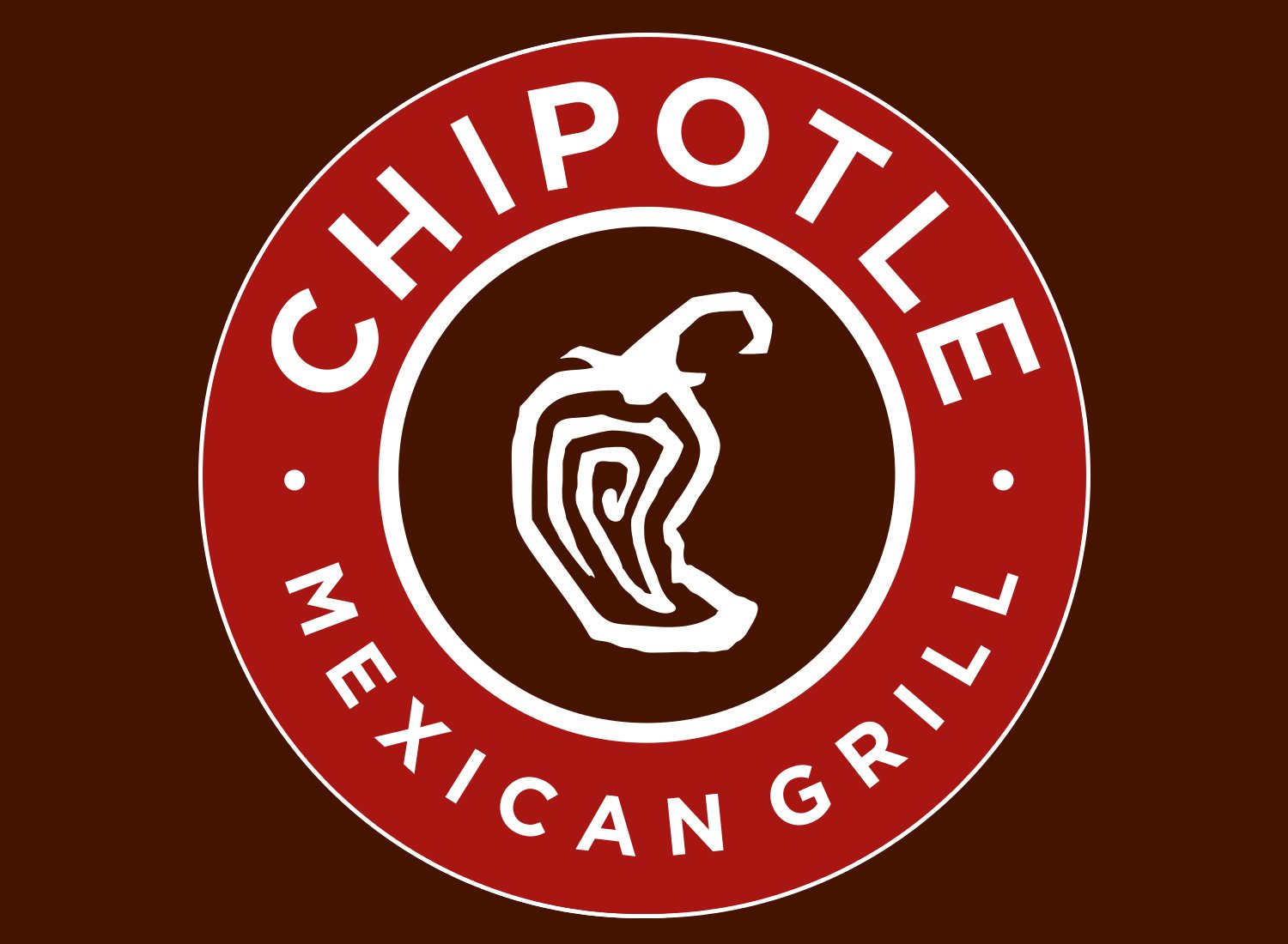
While the company typically makes its advertising materials in house, the 2009 logo was developed by the San Francisco-based firm Sequence. The shape of the pepper is different. In contrast to the previous version, which looked as if it had shrunk a bit, the one designed by Sequence fits the circle better. The thickness of the white letters, the white circle, and the pepper outline is almost identical, which gives the logo a more professional feel.
Font
While the earliest version of the wordmark featured a custom script, for the following variation the designers opted for a more traditional type looking very much like Bank Gothic. Although this choice was somewhat unusual in this case, it worked well the industrial look of the restaurants.
![]()
The 2009 Chipotle Mexican Grill logo seems to feature a customized version of the Gotham Bold typeface. The original version of the geometric font was developed by Tobias Frere-Jones and published by Hoefler & Co. One of the customized letters is the “E” with a low middle bar, giving it a retro feel. On the whole, the type looks friendlier than its predecessor, which may be explained by the rounded letterforms.
Color
![]()
In the 2009 Chipotle logo, the black of the previous version was softened up to a dark red. The palette also features a saturated medium red (Hex: #8C1505 or #A81612, according other sources). The white letters and the outline of the pepper stand out on the red background.
What does the Chipotle logo represent?
The logo of the fast food restaurant chain Chipotle depicts a chipotle pepper, drawn on a circular medallion and accompanied by the name of the company. So there are no hidden meanings, and the badge represents the name of the brand, enhanced by its graphical representation for a more complete and balanced image.
Who designed Chipotle’s logo?
The latest Chipotle logo, based on the previous version, introduced in 2009, was created by the Sequence design bureau. As for the earlier badges of Chipotle, they were designed by the chain’s in-house team, keeping in mind the essence of the brand and its “hot” name.
What does 13 mean at Chipotle?
The number “13” has its special place in Chipotle company’s corporate philosophy. To work for the Chipotle chain you must have thirteen important personal qualities, among which are, for example, being ambitious, positive, honest, and intelligent.
What kind of pepper is the Chipotle logo?
The stylized contoured peppers, drawn in bold white lines on a solid and dark Chipotle badge, are the jalapeño peppers, one of the main elements of the traditional Mexican cuisine, which is the specialty of the famous restaurant chain.
What does the Chipotle Logo symbolize?
First of all, the bright and strong Chipotle logo represents the name of the brand, both by the lettering, and the image, drawn in its center. The second meaning of Chipotle’s badge is the specialization of the chain — Mexican cuisine, and one of its main and most recognizable ingredients, the jalapeño peppers. As for the color palette of Chipotle visual identity, it symbolizes tasty food, intense authentic flavors, and a reliable and trustworthy brand.
What does Chipotle stand for?
The name of the restaurant chain Chipotle stands for the specialization of the brand, the Mexican cuisine, which is known for its hot aromatic flavors, with a lot of Chile and jalapeño peppers in the sauces. As for the literate translation of the word, “Chipotle” means “Smoked Chili” in the Nahuatl language.
What is Chipotle’s motto?
The motto of the Mexican grill restaurant Chipotle has never been written on the primary badge of the company, but sometimes appeared in its advertising campaigns. The current one reflects the main values of the company and sounds like “Better for You. Better for people. Better for Our Planet.” but there was another version of the motto, used by the brand for several years, — “Food with integrity”.
What is Chipotle’s brand promise?
Chipotle is a company with higher moral values and principles, and one of the main lines in its philosophy is the purity of the food and its high quality. The company believes, that all food has to be cooked according to all the ethical norms and the products have to be grown as naturally as possible.
What is the meaning behind the Chipotle logo?
The stylish and modern Chipotle logo depicts the name of the company and the main component of Mexican cuisine, the hot pepper. The message behind this badge is, first of all, the high-quality food, which is rich in flavors and heartwarming. Both the graphical part and the lettering around the medallion’s perimeter, represent the name of the restaurants’ chain, the chain’s specialization, and the progressive approach of the company to traditional things.
Why is Chipotle called Chipotle?
Chipotle is a restaurant chain, specializing in Mexican cuisine, and as everyone knows, the main ingredient of Mexican cuisine is chili pepper. The word “Chipotle” is translated from the Aztec language as “smoked chili”, and gives a name to one of the most popular sauces in Latin American cuisine. The name of the brand is supported by the image of a jalapeño pepper, drawn in the middle of the circular medallion.


