Golden Corral is a Buffet-based restaurant chain with several changing menu items. Entrepreneur Magazine named Golden Corral a leader in the family restaurant sector for the past several years.
Meaning and history
In 1971, James Maynard and William F. Carl had the idea of starting their own company after unsuccessful attempts to franchise with other companies. As a result, Golden Corral was founded in 1972, and on January 3, 1973, the first restaurant of the chain was opened in Fayetteville, North Carolina. A second chain restaurant opened that same year in Raleigh, North Carolina, and a third, in June 1974, was reopened in Fayetteville.
In 1987, they began developing the business through franchising and expanded the menu to include donuts, muffins, cookies, pies, and pizza.
Today, the chain consists of 500 restaurants in 42 states operating under the Golden Corral brand. The restaurants’ dining rooms reach 465 m² of space and seat 475 people each. On Saturdays, one such establishment draws about 900 guests.
Golden Corral is a family-oriented restaurant open for breakfast and dinner. Many foods are grilled, and the restaurant offers customers a wide variety of dishes. The distinctive feature of this chain of restaurants is that it is created on the principle of buffet. There are no major portion weight restrictions like many other restaurants. So you can eat your fill here for a reasonable price.
What is Golden Corral?
Golden Corral is the name of a chain of family-owned restaurants spanning more than 40 American states. It is loved by both locals and tourists. All thanks to the variety of food and drinks, pleasant interiors, and strict adherence to quality standards.
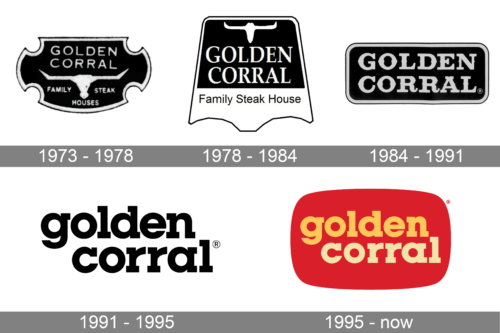
In terms of visual identity, Golden Corral’s history can be split into two periods: the “steak-oriented” stage, which lasted from the foundation of the brand until 1991, and the modern era, with a minimalistic approach to design.
1973 – 1978
The original Golden Corral logo, introduced in 1973, has stayed with the restaurant chain for around five years. It was an elegant crest with arched sides, rounded cut-outs, and sharp angles. The black body of the crest was outlined in white, and supported by the white uppercase lettering written above the white bull’s skull image. The composition was underlined by the “Family Steak Houses” tagline.
1978 – 1984
The redesign of 1978 has played with the composition of the Golden Corral logo, keeping its main elements and the color palette almost untouched. The new badge had a “label” shape, with the top part having a solid black background, where the bold white lettering was written in all capitals of a serif font and a white silhouette of a bull’s skull above it. The bottom white part of the badge featured a black title case “Family Steak House” tagline.
1984 – 1991
In 1984 the concept of the brand’s logo was simplified, with the graphical element removed from the composition. Now it was a horizontally oriented rectangular banner with rounded corners, set in solid black with a light gray outline. The name of the chain was written in bold gray capitals of a full-shaped wishbone-style typeface, resembling traditional Wild West Saloons.
1991 – 1995
The new era of the Golden Corral visual identity design started in 1991, with the laconic text-based logo introduced by the designers. The rethought badge featured a bold lowercase lettering in black, written against a plain white background. The geometric serif typeface made the simple logo look confident and distinctive, showing the professionalism of the company and its fundamental approach.
1995 – Today
The redesign of 1995 has added colors and vitality to the Golden Corral logo. Now it is a softened rectangular banner with the stiletto arched sides, colored in solid red with a two-leveled lettering on it. The upper line of the inscription features a warm orange shade, while the bottom one, slightly shifted to the right, is drawn in light yellow. Both parts of the wordmark are written in a bold serif typeface with square serifs and straight cuts of the lines.
Font and color
The bold lowercase lettering from the primary Golden Corral logo is set in a heavy geometric serif typeface, Lubalin Graph. The shapes of the characters evoke a sense of stability, reliability, and excellence.
As for the color palette of the Golden Corral visual identity, it is based on an intense and warm combination of red, orange, and yellow, which evokes a sense of friendliness and coziness and transmits the welcoming atmosphere and comfort food of the chain’s restaurants.


