Chattanooga Mocs is the name of an athletic program from the University of Tennessee at Chattanooga, also known as just UTC, which was established in 1886. The program is composed of 16 men’s and women’s teams, which are all members of the Southern Conference.
Meaning and history
Chattanooga Mocs teams are all part of the Southern Conference, an organization, established in 1921, and affiliated with the National Collegiate Athletic Association. As for the NCAA, the men’s football team from the University of Tennessee at Chattanooga plays in its first Division, in FCS, which is a special football subdivision of the association.
What is Chattanooga Mocs?
Chattanooga Mocs is a collegiate athletic program of the University of Tennessee at Chattanooga, which consists of six men’s and ten women’s teams competing in different sports disciplines, including Basketball, Football, Golf, Soccer, Indoor, and outdoor Track&Field, and others.
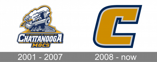
In terms of visual identity, the difference between the Chattanooga Mocs logo, created in 2001, and the badge from 2008 is more than just huge. The athletic program of the University of Tennessee at Chattanooga went from an ornate, full of elements composition to an extra-minimalistic badge with just one symbol on it. The only thing that stayed untouched was the yellow and blue color palette.
2001 – 2007
The Chattanooga Mocs logo, designed in 2001, was composed of a gray and white emblem in a blue outline, set above the three-leveled inscription with the full name of the University, and its Athletic program. The strong and modern emblem of the Mocs featured a detailed image of a train with a mockingbird in a striped hat. The train was there to celebrate the railway legacy of Chattanooga, a tribute to the University’s motherland and history, while the mockingbird is the mascot of the athletic teams of UTC, hence the name of the program — the Mocs (shortened from the Mockingbirds).
The lettering had upper and bottom lines set in yellow, balancing the bold yellow outline of the whole badge. The central line of the banner featured an enlarged white “Chattanooga” in all capitals of a bold custom typeface, with the first and last letters of the wordmark enlarged. It was outlined in blue and had a geometric yellow-shadow at the bottom. The whole badge looked very intense and well-balanced.
2008 – Today
The redesign of 2008 removed…everything from the Chattanooga Mocs logo. The new concept of the visual identity design of the University of Tennessee at Chattanooga athletic program is built around one symbol — the extra-bold capital letters “C”. It is set in a solid dark-yellow color, with a double outline in light-gray and blue. The upper part of the letter features a square serif, which is curved to the inside, while the bottom part is straight, with a strict square cut.


