

![]() Chatime Logo PNG
Chatime Logo PNG
The teahouse brand Chatime was started in 2005 in Hsinchu, Taiwan, by Henry Wang Yao-Hui. Only a year later, it opened its first outlet outside its native country. From the beginning, its parent company was La Kaffa Coffee. The fact that one of the world’s most popular bubble tea marks comes from Taiwan seems natural as the beverage itself originated in this country (this happened in the early 1980s).
Meaning and history
![]()
In spite of rather frequent updates, the Chatime logo has preserved some elements of its visual brand identity intact over time. The newer versions appear more meaningful and refined.
2005 – 2010
![]()
The original logo included the company name in English and Chinese, with the latter dominating the design. It was partly due to the position – the Chinese wordmark was on the top, – and partly due to the fact that the hieroglyphs were larger than the English letters.
Another interesting observation to be made while comparing the two wordmarks is that they feature fundamentally different styles. In the case of Chinese lettering, it is casual and laid-back, dynamic and light. It has been drawn manually. We can see this in the uneven shape of the elements and the “flying” strokes. The English version, conversely, is business-like, heavy, and slightly old-fashioned due to the serifs and the pronounced contrast in the thickness of the lines.
While it’s now impossible to say for sure whether this difference was introduced on purpose, we can guess that it was just unintentional. For one, it doesn’t work very well. Also, this contrast disappeared in the following version, which suggests that the brand’s design team perceived it as a mistake.
2010 – 2016
![]()
This is when the iconic tea leaf emblem was introduced, which became the most recognizable part of the Chatime logo. It combined the product with the raw material from which it is made and did so in an elegant and appetizing style. The tea lea was delicate and rather realistic, as was the drop of the precious drink falling from its edge.
It was quite lucky that the original purple color of the wordmark worked well with green. It gave the designers a chance to use this relaxing color, which also connotes with nature (and thus health) and is, eventually, the color of the tea leaf.
The typography went through a complete overhaul. This time, the English wordmark adopted the laid-back, casual, and personal style characteristic of the Chinese lettering in the previous logo.
What is Chatime
Chatime is a Taiwanese teahouse chain, one of the best-known teahouse franchises in the world. Back in early 2019, it boasted over 2500 locations in 38 countries, from China and Malaysia to Canada, United States, and Japan.
The updated logo had several versions. In addition to the purely English version, there were at least two bilingual ones. One of them was dominated by the English wordmark with the Chinese name in black given in the lower right corner, while in the other, the proportions and positions of the elements were reversed.
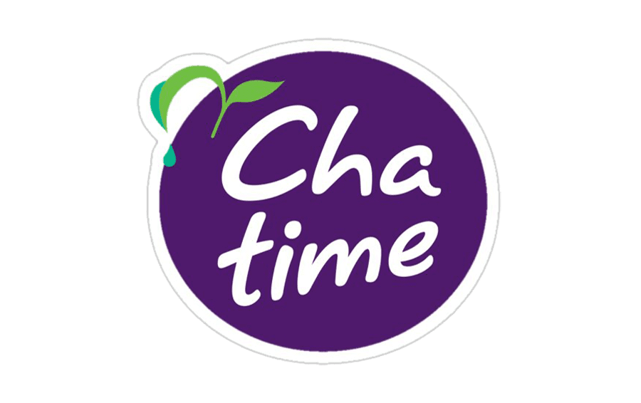
2016 – present
![]()
The wordmark became slightly cleaner and better legible without sacrificing its distinctive style. The color of the tea leaves grew lighter, and the drops on the left side were colored in a different shade of green – it looked more like teal.
Colors and font
While the original Chatime logo was purple, it was later enhanced with a green accent, to introduce the color of the tea leaf. Later, teal was added, to emphasize the clear drop falling from the leaf. The new color contributed to the “natural” and “clean” themes.
The cursive script imitates a handwritten note, to suggest that the brand has a personal approach.


