Castrol is a manufacturer of industrial and automotive lubricants. The range of products includes oils, greases, and similar products. The headquarters are located in Pangbourne, Berkshire, UK, and Wayne, New Jersey.
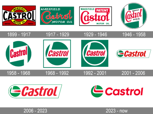
The Castrol logo has gone through around ten modifications so far.
Meaning and history
The history of the famous petroleum products brand started in 1899, when Charles Wakefield left the Vacuum Oil Company, rented three small rooms on the third floor of Cannon Street in central London, and on March 19, 1899, C.C.Wakefield & Co. opened hisfirm, CC Wakefield & Co.
In 1909, C.C. Wakefield& Co. began producing a new automotive motor oil called Castrol. The company developed lubricants for use in internal combustion engines for automobiles, motorcycles, and airplanes. The brand name Castrol is an abbreviation of one of the main ingredients used in the production at that time, castor oil.
In 1966, Castrol was acquired by the British company Burmah, which was renamed Burmah-Castrol. In turn, Burmah-Castrol was acquired by BP Amoco plc in 2000, which was later renamed, so,since 2000, the Castrol brand and all its assets belong to BP. Lubricants under the Castrol brand continued to be sold worldwide and became market leaders in many countries.
What is Castrol?
Castrol is the name of a British company, which was established at the end of the 19th century, and today is a part of BP, specializing in the production of lubricants, greases, and oils for automobiles. The company operates worldwide and has a perfect more than a century-long reputation.
1899
The history of the brand can be traced back to Wakefield Oil Company established by Charles Cheers Wakefield in 1899.
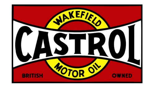
The earliest logo showcased the word “Castrol,” which started to be used after researchers decided to put castor oil to the lubricants. It is written in bold black letters over a white banner, while the words “Wakefield” and “Motor oil” can be seen above and below it respectively.
1917
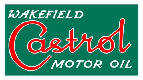
A fancy cursive script imitating handwriting was used for the word “Castrol.” It was red with white trim. The background was green. Like in the previous version, the words “Wakefield” and “Motor oil” could be seen above and below (respectively). Yet, the typeface and position were different.
1929
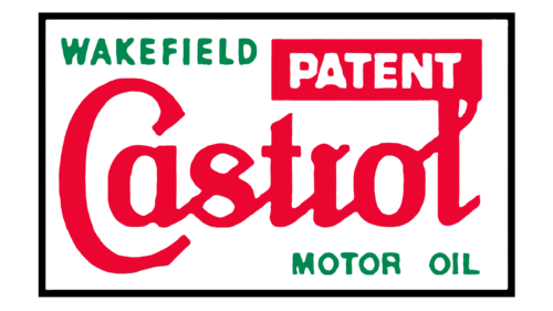
The central word still featured a cursive script. The letters grew bolder, though, and their shape was modified. The background went white, while the words “Wakefield motor oil” were green. The lettering “Patent” stood out due to the red background.
1946
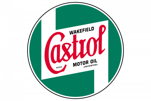
The first Castrol roundel was introduced in 1946. The red script lettering from the previous version got placed inside a solid green circle with a double white and black outline. Both the red logotype and the black additional lettering were set over a white geometric element in a shape of parallelogram with two elongated fragments, stretched vertically to the frame.
1958
The design grew by far cleaner and easier to grasp. For one, the black trim around the circle disappeared. The cursive script was replaced by a highly legible (although generic) sans serif type. All the words apart from “Castrol” disappeared.
1968
The name of the brand was moved to the horizontal position and the lower white “road” disappeared, to make the design cleaner. And yet, the authors added a green rectangular frame, which did not seem necessary.
The type became flatter, which somewhat enhanced the legibility. The letters were italicized to add some dynamism.
1992
The colors on the outer part of the Castrol logo were inverted, probably in an attempt to make the design look like a single whole.
2001
The old logo was turned into a small roundel, next to which “Castrol” in large red letters was placed. This move helped to emphasize the name of the brand without losing the connection with the brand’s visual heritage.
2006 – 2023
There was a barely noticeable shift in the palette and shape.
2023 – now
The redesign of 2023 has modernized and emboldened the iconic logo, cleaning up the contours and strengthening the details of the badge. All the lines on the green, red and white emblem are solid now, which makes the image more intense and bright. As for the logotype, it’s typeface was changed to a more traditional sans-serif, with full-shapes characters balancing the circular shape of the emblem.
Font and Color
The bold italicized lettering from the primary Castrol badge is set in a sleek and elegant sans-serif typeface with narrowed contours and arched lines of the title case characters. The closest fonts to the one, used in this insignia, are, probably, Noa Pro Condensed Bold Oblique, or Afire Bold Oblique, with some significant modifications of the contours.
As for the color palette of the Castrol visual identity, it is based on bright red and green elements, and a plain white background, which adds contrast and intensity to the whole composition. Red is a color, standing for energy, progress, and power, while green adds dynamic, speed, and a sense of growth to the Castrol badge.
The italicized font on the current Castrol logo is highly legible and has a unique touch. You can notice it in the unusual combination of rounded and sharp elements.
Green, red, and white have been the colors of the logo since 1917. Only the logo used at the beginning of the previous century featured a different palette.


