Campbell’s is a legendary American brand of canned food manufacturer, which was founded in 1869 by Joseph Campbell. The brand became extremely popular after the iconic artist, Andy Warhol, used its tags for his painting.
Meaning and history
Can a soup label become a source of inspiration for an artist? Yes, if it is the Campbell’s logo.
Here is the story of how the label was created and how it became part of the Pop Art culture.
1895
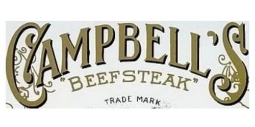
The original Campbell’s logotype featured an elegant arched wordmark written in a fancy custom typeface in calm gold color. The first and last letters of the inscription were accompanied by a fancy ornament, which added an art-deco mood to the whole composition.
1897
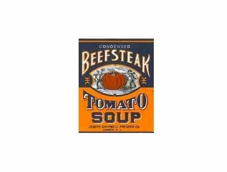
The first label featured gold lettering over the white background. The words “Campbell’s” and “Tomato” were arched. In between, there was a stylized depiction of two men carrying a huge tomato. According to the explanation given on the brand’s website, the design reminded us that there was a whole tomato in each can.
1898 – 1953
The first red inscription was introduced by the brand in 1989. It was a custom cursive lettering in bright red with the lines of the letters elongated and thick and the angles — rounded. The inscription featured its contours a bit narrowed, which made the whole logo look harmonized and stable.
1953 – 2000
The redesign of 1953 brought the iconic emblem to the brand. This was a logotype, we all can still see today — a custom red inscription with the first “C” curved. It was placed on a white background with no outlines or framing.
2000 – 2003
In 2000 the iconic nameplate gained a thin black outline and shadow, which made it look more energetic and sleek, evoking a sense of dynamics and movement. The red color of the logotype became a bit darker and warmer.
2003 – 2021

In 2003 the brand came back to its iconic wordmark from 1953, removing all the black details and elevating the red color of the letters to a lighter and brighter shade. The Campbell’s emblem is strong and timeless, looking perfect in any surroundings and on any style of the background.
2021 – Today
 The iconic Campbell’s logo was redesigned again in 2021. Not that there are any dramatic changes, or something, visible from the first sight, but a few elements were changed, and this made the legendary red logotype look progressive and fresh. First of all, the color. The Campbell’s red became a bit darker and more intense, still with a slight burgundy shade in it. Secondly, the typeface — it was changed, with the contours of the letters cleaned and the tails shortened, so now all of the letters in the logotype are separated from each other, this more air got to the logo, and it became lighter and more elegant. The first letter “C” is what got changed the most — its tail was shortened, and the curve was removed, as for the upper part of the letter, the loop now has more white, so looks smoother than on the previous traditional version.
Further evolution
During its first years, the Campbell’s soup logo went through minor modifications.
What about the designers behind the original and altered versions? According to Jonathan Thorn, the brand’s corporate archivist, history has not preserved specific information on those who designed the label. It was the result of “a cooperative effort.” It is believed that the first firm that printed out the labels, Sinnickson Chew & Sons Company, played an important part in developing the original logo.
Font
The script on the Campbell’s logo is not unlike the signature of Joseph Campbell, says Thorn.
One of the reasons for imitating handwriting was to appeal to housewives of the time, according to some experts. Such a script conjured up the recipes written by hand, which ladies often exchanged back then. This added a homemade feel to the label.
Also, we can suppose that the “homemade” illusion was appreciated by those who neither had a wife to prepare such a meal nor the time to do it on their own. This group was a more obvious target audience of the product than the housewives.
Andy Warhol and his Soup Cans
In 1961-1962, artist Andy Warhol, a leading figure in pop art, created his Campbell’s Soup Cans, a collection of 32 canvases featuring a painting of soup can – one of each of the flavor the brand offered at the time. Later, the artist went on experimenting with the labels, which resulted in more surrealistic paintings.
In 2004, the Campbell Soup Company, in its turn, introduced a limited-edition series of cans inspired by Warhol’s pieces. In 2012, these cans were reintroduced as a result of an exclusive retail partnership with Target.


