CaixaBank is one of the largest Spanish financial organizations, which was established in 2011. Today the company operates across the country, being in the top3 of the most popular banks, having 40 thousand employees and total assets of almost 400 million USD.
Meaning and history
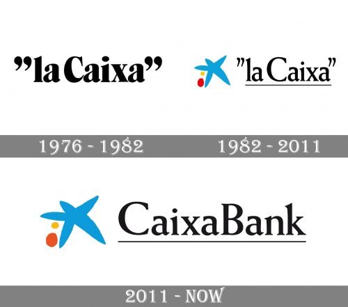
The modern Spanish bank has a pretty long history: it was established in 1904, under the name “Caixa de Pensions per la Vellesa I d’Estalvis”, and was one of the most trusted financial institutions in the country. In 1976 the bank was renamed into “La Caixa” and has grown into a huge company with thousands of offices and ATMs across Spain. CaixaBank appeared in 2011 due to the huge rebranding of the institution and its new era and approach.
1976 – 1982
The first logo for La Caixa was introduced in 1976 and featured a sleek serif inscription in black, placed between two quotation marks, with only “C” capitalized. Its simplicity and monochrome palette were balanced by the thickness of the lines and rounded contours, which looked chic and elegant. This logo stayed with the bank for six years.
1982 – 2011
In 1982 the graphical emblem was designed to add some recognizability and freshness to the black wordmark. It was a stylized five-pointed Star in light blue and two solid dots in yellow and red on its left. The star was hand-drawn and looked very friendly and inviting.
As for the lettering, it’s typeface was changed to a more lightweight one, which looked more modern and balanced. The inscription was now underlined, with a black thin line.
2011 – Today
With the change of the bank’s name to CaixaBank, the text-part if the logo was also changed. Though it featured the same typeface, that was used on the previous logo version, the letters became slightly smaller. All the other details remained untouched, just the star gained a bit darker shade. While the red dot on its left — a lighter one.
Font and color
The sleek serif lettering of the CaixaBank visual identity is executed in a very elegant and timeless serif typeface, which is pretty close to such famous font as Weiss Bold. There is also a similarity with Emília Bold font.
The blue, yellow, and red color palette of the bank’s emblem, standing for loyalty, energy, and passion, is brilliantly balanced by a delicate black inscription, which adds professionalism, stability, and a sense of authority to the whole image.


