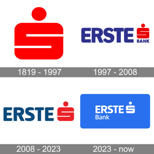
The Erste Bank logo nicknamed the “savings bank S” has gone through at least four modifications so far. In addition to it, the bank has also used a bee emblem.
Brand Overview
While Erste Group Bank AG in its modern form was founded in 2008, its roots as the first Austrian savings banks can be traced back to 1819. Today, it is among the best-known financial services providers in Central and Eastern Europe. Its client base consists of over 15 million clients, while the number of branches exceeds 2,650.
Meaning and history
Looking at the primary logo, you may wonder what the red symbol on it means. The design features the “S” glyph in the form of a savings box. The red circle above symbolizes a coin.
The roots of the emblem go to a 1938 design by the Viennese poster artist Lois Gaigg. It was used by quite a few savings banks in Germany. It looked pretty much like the current emblem of Erste Bank but there was a stylized nozzle for inserting money. In fact, in the original Erste Bank logo, the nozzle was also present. Here, the “saving banks S” was placed inside a hexagon.
In 1971, the designer Otl Aicher redrew the symbol. He removed the nozzle and colored the letter bright red. By the way, around this time, many saving banks in Austria also adopted this symbol.
While the overall style of the “S” has remained the same, it has gone through another facelift more recently.
1819 – 1997

For almost two centuries, the company used a stylized “S” as its emblem. It had a rectangular form with rounded corners and slits on either side to create the letter “S”. The shape was meant to represent a savings box with a round coin placed above it. The red color of the emblem instantly caught the attention and reflected the powerful and strong position of the institution.
1997 – 2008
In 1997, the company went public, while its collaboration with other savings banks in Austria grew closer. This was one of the reasons why they decided to choose the “S” as their shared symbol. Now, it has the status of the official logo of the entire Savings Bank Group.
The wordmark has not remained the same, too. The original bee was replaced by the Roman numeral “1.” It was placed in the middle of the name of the bank. Interestingly, you could also see the red dot similar to the coin in the “S” logo.
2008 – 2023
The previous logo did not stay with the bank for relatively long. At the same time, the new version was just an improvement rather than the introduction of something brand new. The designers introduced a new font that looked a lot like Signor Bold and resembled the rounded forms of the “S” sign. The latter was made larger with no “Bank” inscription underneath.
2023 – now
Although the new logo preserved the font and symbol as seen in the previous version, it had a completely different feel. The inscription was done in white and placed on a large blue rectangle with rounded corners. The blue color gave a feeling of freedom and unlimited possibilities and its shade did not look worn out.
Bee emblem
Historically, the Erste Bank logo featured a bee. According to the explanation on the bank’s website, some of the connotations due to which this symbol had been chosen were as follows: “fertilizing, busy, organized, lively.” The explanation mentions that the bee has been known as an emblem of life and growth. It has been used as a logo not only by Erste bank but by other savings banks, too.
While the official logo does not feature the busy insect, it is still used by the company. For instance, you can see it on the gable of its building at Graben 21 in Vienna, as well as on other savings bank buildings in Central Europe.
ERSTE Foundation also uses the bee as the logo for its programs designed for Central and Eastern Europe.
Font
The type on the Erste Bank logo has gone through updates, too. The older version with the Roman number “1” features an italicized font. Later, the letters were straightened.
The current version showcases a minimalist yet distinctive type. While the structure of the letters is pretty traditional, the shape of the ends of the glyphs adds a unique touch.


