Caillou is the name of a book series for kids, which was created in 1989 by Canadian writer Christine L’Heureux. The books, which were originally written in French were translated into English and instantly became popular across the globe, becoming a base for the tv-series about a little boy, named Caillou.
Meaning and history
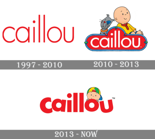
The visual identity of the famous Canadian kids series has always been very tender, though there is a big difference between the minimalist original version, created in the 1980s, and the today’s modern and bright logo, the mood of it has stayed untouched — it is warm, welcoming and very king.
1997 – 2010
The original Caillou logo was a simple wordmark in the lowercase. It was written in red on a white background and executed in a simple yet stylish sans-serif typeface, which is very similar to Sophi Sophi Regular and Futura SH ExtraLigjt, with its thin and smooth lines.
2010 – 2013
The logo gets its first redesign only in 2010. The typeface remains the same, but lines become thicker, and now the wordmark is white and placed on a red background? Enclosed in a thin blue rounded frame. The main version looks bright yet still pretty simple, so the designers created several additional emblems, where Caillou, the main character of the series, is drawn above the nameplate in different poses and styles.
2013 – Today
In 2013 the logo was redesigned again, and now it is a completely different compo-sition, with n ExtraBold lettering in sans-serif, where letters are jumping and the first “C” is slightly bigger than other symbols.
The main color palette remains red and white, but all the framing is gone, and the graphical part is now constant. Caillou in his striped cap peeks out from behind a letter “O”. It’s like an invitation to play and spend time together, which looks very cool and friendly.


