![]() Bushnell Logo PNG
Bushnell Logo PNG
Bushnell is the brand of telescopes and binocular manufacturing company, which was established in 1948 in Japan. Today the company headquarters in the United States and has its operating offices all across the globe.
Meaning and history
![]()
The Bushnell visual identity has been very constant throughout the company’s history. Based on the wordmark and an emblem on its left, it was redesigned keeping the shapes and concept of the original logo.
The Bushnell nameplate is executed in a smooth and modern sans-serif typeface with bold lines and rounded angles of the letters. The inscription looks neat and stylish in a brand’s signature gray color.
The Bushnell emblem features the letter “B” enclosed in a circle. The font used for the emblem is the same as for the wordmark, which makes the logo look balanced and harmonized. The color palette is also the same, so the whole composition is unified and boasts one style.
Before 2017
![]()
The previous Bushnell logo had a three-dimensional emblem, with a black background and bolder lines of silver “B” and the outline. By simplifying its visual identity design, Bushnell made its logo more modern and elegant.
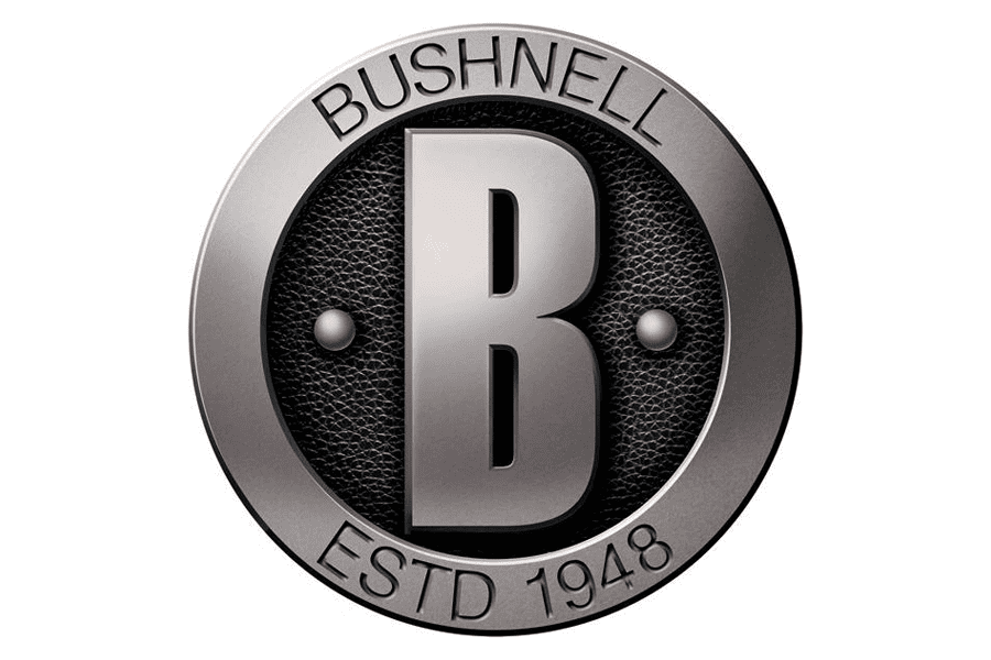
The gray-on-white color palette is a reflection of a stable and reliable brand, which values the quality and comfort of its customers.
2017 – Today
![]()
The redesign of 2017 has simplified and strengthened the Bushnell visual identity, redrawing it in a flat black-and-white palette. The emblem now featured a solid black “B” enclosed into a black ring frame and placed above the title case logotype in a modern geometric sans-serif font with straight cuts of the bars and extended contours of the characters. All elements are drawn in flat black lines.