Borussia Dortmund, often called just BVB, is a sports club headquartered in Dortmund (Germany). The distinctive logo has boosted the club’s popularity throughout more than 100 years of its history.
Meaning and history
At the end of the 19th century, the Borussia name was very common in German football clubs. As it was a modified name for Prussia, and at that time there were various Alemannia, Britannia, Teutonia, and Arminia names in vogue. There were a lot of Borussia formed – about sixty of them at the moment. And in the Bundesliga over the entire history of its existence, there were four of them: Dortmund, Mönchengladbach, Berlin, and Neunkirchen. The most famous are the first two – they are the glory of German soccer. Between them, they have 11 championships, five German Cups, and European trophies. Dortmund has the Champions Cup and the Cup Winners’ Cup, while the team from Gladbach has two UEFA Cups.
The Borussia Dortmund football club plays in the Signal Iduna Ork Stadium, Stadium, which is one of the largest and most comfortable arenas in Europe, according to the FIFA classification – five stars. It was built in 1971-1974 for the World Cup and had a capacity of 54 thousand spectators.
What is BVB?
BVB is the shortened name of the Borussia-Brauerei Dortmund football club, which was established in 1909, and by today has grown into one of the serious German football teams, taking confident positions in the championships’ line-ups.
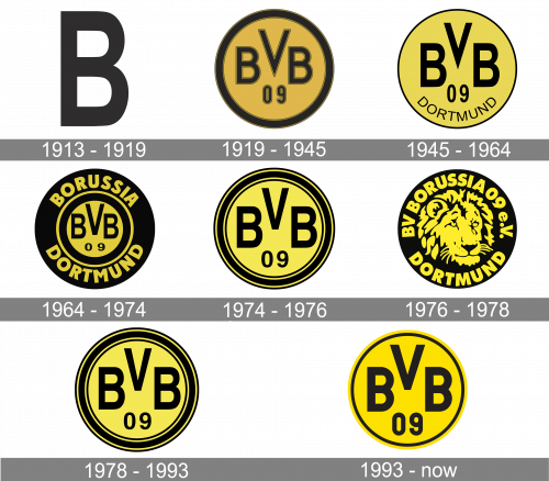
1913 — 1919
The club’s original logo looked like a black, capital ‘B’. That’s it.
1919 — 1945
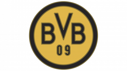
The following logo depicted a yellow circle with a thick black frame. In it, there were the ‘BVB’ letters, arranged in an arch. They were all black with some brown outlining. Below the ‘V’, they’ve also put the number ‘09’ in a similar style.
1945 — 1964

Although the club’s history dates back to 1909, we will start from its 1946 logotype. It looks strikingly similar to the current BVB logo: the same three letters “BVB” and the number “09” below, the same color scheme, the same circle shape with a black outline. Unlike the modern version of the logo, the original one included the word “Dortmund”.
1964 — 1974
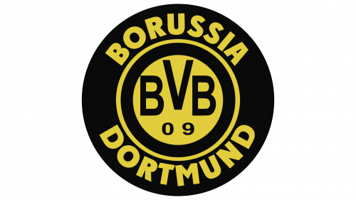
In 1964, the centerpiece of the logo became more simplistic than before. They removed the outlines and changed the letters to a more mundane font. The yellow core was surrounded with a thick black frame, which was then outlined with a thin yellow layer. Lastly, a big black ring bearing the words ‘Borussia Dortmund’ in yellow outlined it all.
1974 — 1976

Over the following years, the Borussia Dortmund logo has been revolving around the same visual core.
1976 — 1978

The only notable exception has been the 1976-1978 version, where a lion’s muzzle was placed in the center of the logo.
1978 — 1993
The 1978 design is exactly the same as the old 1974 logo.
1993 — Today
The logo Borussa Dortmund has been using since 1993 looks very much like the previous version except for a couple of minor changes. The first thing, the club got rid of two of the black rings, leaving only one and making it bolder. Also, the font itself became bolder.

Borussia Dortmund charitable trust logo
The club is known for its charity initiatives. In the fall of 2012, they created a charitable trust named Leuchte Auf. It’s aimed at providing financial support for social projects.

If you compare the Borussia Dortmund logo 512×512 and the logo of the trust, you may notice that they are absolutely different, yet share the same stylistic approach. The logo of the trust features a star. Each of the rays is a street. The rays meet at Dortmund’s Borsigplatz, where Borussia Dortmund was founded.
Font

The minimalistic sans serif typeface of the current wordmark is bolder than most of its predecessors.
Color

Since 1945, the BVB logo has been using the combination of black and yellow. Whatever changes the logotype went through the club has never refused of this scheme.


