

![]() Buffalo Wild Wings Logo PNG
Buffalo Wild Wings Logo PNG
Buffalo Wild Wings is a popular American chain of restaurants, which was established in Ohio in 1982, and today has more than 1,2 thousand locations across the United States, Mexico, United Arab Emirates, Saudi Arabia, Panama, India, and the Philippines.
Meaning and history
![]()
The company, which today is present not only in all the states of the USA but also in six other countries, was founded in 1982 as Buffalo Wild Wings & Weck by Jim Disbrow and Scott Lowery. The first restaurant of the chain, which specializes in Buffalo wings and sauces, was opened in Ohio, near the Ohio State University. Ten years later, in 1992, Buffalo Wild Wings started working as a franchise, which let it grow into a globally present brand, with more than a thousand restaurants internationally.
Since 2018 the chain is owned by Inspire Brands, an American company, which has several loud fast-food labels in its portfolio.
What is Buffalo Wild Wings?
Buffalo Wild Wings is the name of a casual-dining restaurant chain, founded in the United States at the beginning of the 1980s. The main specialization of the brand’s restaurants is chicken wings, hence the name of the chain. Today Buffalo Wild Wings owns over 1,200 restaurants internationally.
In terms of visual identity, the company has been loyal to the badge, introduced in 1998, after its rename from Buffalo Wild Wings & Weck. Although, throughout the years the logo was refined several times. The insignia looks very cool and modern due to the use of an intense color palette and solid silhouettes.
1982 – 1998
![]()
The original logo for the company, established in 1982 as Buffalo Wild Wings and Weck, was introduced in the same year. It was a bold and very masculine badge in a circular shape, with the dark brown contours of a Buffalo bull on a gradient beige background, and brown lettering is written around the perimeter of the roundel, from the inside. The first letter of each word in the inscription was emboldened and set in red, being supported by the heavy red “BW-3” set at the bottom of the composition.
1998 – 2012
![]()
After the rename of the company, the new logo was created in 1998. This version has become a basis for the iconic badge, still used by the brand today. It was a solid yellow roundel in a thick black outline, overlapped by a horizontally-stretched black rectangular banner at the bottom. The roundel comprised a black silhouette of a bull with white wings, drawn in profile, facing to the left. As for the banner, it had two-leveled lettering in white, with the bottom line decorated by two yellow five-pointed stars with three arched tails each.
2012 – 2018
![]()
The redesign of 2012 has placed the circular yellow and black emblem on the left from the rewritten inscription, which was now set in three lines, with the emboldened uppercase characters executed in a fancy custom typeface, where the massive contours were decorated by small triangular elements on top parts. As for the graphical element of the logo, it got come delicate gray details on the wings and the body of the bull added volume to the composition.
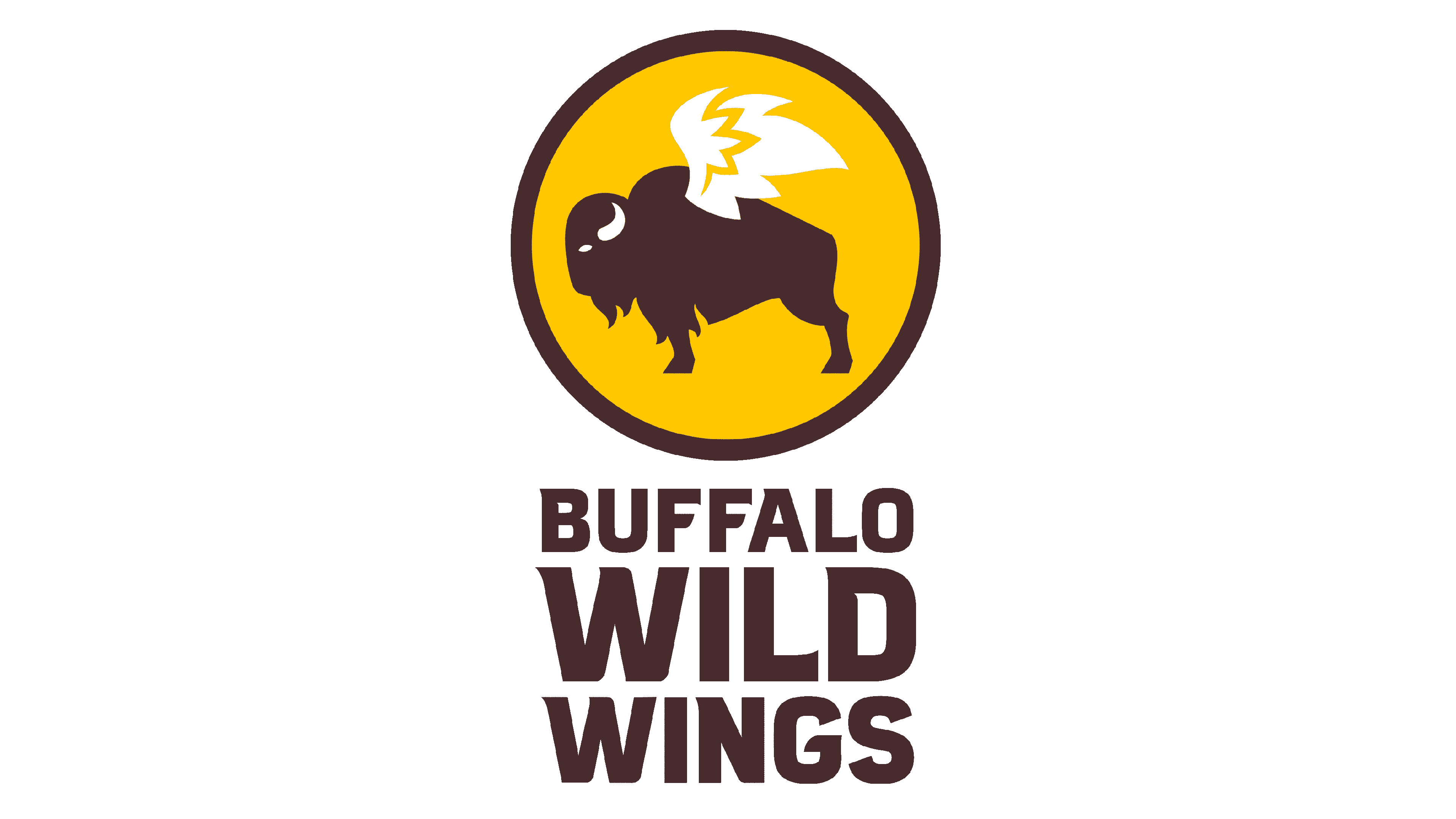
2018 – Today
![]()
In 2018 the logo of Buffalo Wild Wings was redesigned again, with the color palette switched to a smoother one. The black shades got brown, and the gray elements were removed from the badge, making it flat and cool again. As for all other elements of the logo, they remained untouched.
Font and color
The sleek and heavy lettering from the Buffalo Wild Wings primary badge is set in a custom font with massive characters and delicate triangular serifs on the rods of orange lines. The closest fonts to the one, used in this insignia, are, probably, ITC Mixage Std Black, or Brickton Regular, but with some significant modifications of the characters’ contours.
As for the color palette of Buffalo Wild Wings’ visual identity, it is based on a soft and warm combination of yellow and brown, with white accents, where yellow stands for energy, brown — for coziness and taste, and white — for loyalty of the brand to its customers, and the reliability of the chain.


