The Buffalo Braves is the old name of the basketball team the Los Angeles Clippers. This name was used from 1970 to 1978 before the team relocated to San Diego and received another name – the San Diego Clippers. The current name was adopted upon the relocation to Los Angeles in 1984.
Meaning and history
Buffalo Braves was the first name of today’s famous Los Angeles Clippers basketball club, which was established in 1970 and relocated to San Diego in 1978. Though the Buffalo period of the club was pretty short and only lasted eight years, it played an important role in the formation of the team and its future success.
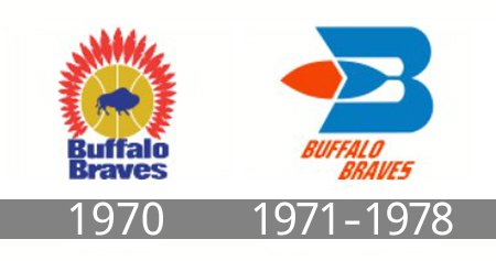
1970 — 1971
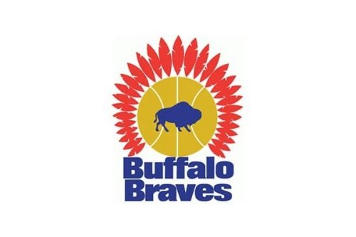
The initial Buffalo Braves logo was executed in a very bright and delightful yellow, red and blue color palette, where the blue silhouette of a bull was placed on a yellow and white basketball and enclosed into a red frame, formed by numerous stylized feathers. The bold sans-serif lettering was placed in two levels under the image and added a sense of stability and confidence to the lively badge.
1971 — 1978
The redesign of 1971 completely changed the visual identity concept of the club, redrawing its logo in a more modern and artsy way. The new emblem featured a stylized light-blue letter “B” with had a red, blue, and white feather placed in its middle and coming out of it to the left. The end of the feather marked a smaller white letter “B”, creating a “BB” image, standing for the name of the club.
The “Buffalo Braves” inscription was placed under the emblem and written in a traditional sans-serif, using the same shade of red, as on the feather.
Font and color
The delicate yet professional sans-serif typeface of the narrowed and italicized Buffalo Braves wordmark strengthened the whole logo, adding a sense of movement and progress to the club’s identity. The geometric font with numerous angles and distinct cuts of the letters was pretty close to the contours of Cairoli Classic Condensed and Silent Echo Italic typefaces if they were turned into hexagons.
As for the color palette, the combination of blue, red, and white shades made the emblem look patriotic and passionate, while the prevailing, blue, color, reflected loyalty and reliability of the club, and its professional and fundamental approach to the game.


