Meaning and history
1996 – 2003
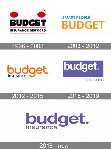
The first Budget logo was created in 1997 and stayed with the insurance company for only a little more than five years. It was a red and black badge placed in white background color with the logotype as the main element. The “Budget” lettering in the uppercase was executed in ExtraBold sans-serif typefaces and had its massive black letters placed above the “Insurance Services” tagline, enclosed between two red horizontal lines. Above the text part of the logo, there were two solid red circles on the left and right sides. The right circle had a small arrow, pointing upright, set above it.
2003 – 2012
In 2003 the logo was completely redesigned. All graphical elements were removed, as well as the horizontal lines, framing the tagline. The new concept was built around a delicate uppercase “Budget” logotype in orange, and “Smart People” additional lettering in bright blue, written in the uppercase above the main wordmark.
2012 – 2015
The company’s 2012 logo consisted of the words ‘Budget Insurance’, which again had got a new style. The wordmark used an office sans-serif font with lowercase letters. The upper ‘Budget’ was enlarged and colored orange, while ‘Insurance’ had a dark blue palette.
2015 – 2019
The following redesign of the company logo depicted the brand name with a fresh style. The white ‘Budget’ word got a yellow dot and was drawn over the purple rectangular, while the ‘Insurance’ was located out of the whole picture. Both words had ф simple open sans font.
2019 – Today
The 2019 logo shows the familiar inscription with the same style as it was in 2012 – bigger ‘Budget’ above lower ‘Insurance’. The colors and font, though, remained as they were in 2015.


