Brussels Airlines is the flag carrier and largest airline of Belgium. Brussels Airlines is part of the Lufthansa Group.
Meaning and history
The Belgian airline Brussels Airlines was created through the merger of SN Brussels Airlines and Virgin Express.
On April 12, 2005, SN Airholding (owner of SN Brussels Airlines) entered into a merger agreement with Virgin Express, Europe’s first low-cost airline.
On November 7, 2006, the creation of Brussels Airlines was officially announced, and the new airline began its first flights on March 25, 2007.
Since 2008 the gradual takeover of the parent company SN Airholding by the Lufthansa Group holding company began. Initially, a 45% stake in the Belgian airline was purchased with a further option. Among the terms of the agreement it was stipulated that Brussels Airline would necessarily join the international airline alliance StarAlliance. This strategic partnership was approved by the EU, and Lufthansa bought all 100% of the shares before 2011.
By entering into Code Sharing agreements with major airlines in Europe, Asia and America, Brussels Airlines was able to offer its passengers the widest range of flights to all destinations, which is more than 50 in Western Europe and more than 70 in other countries and continents.
What is Brussels Airlines?
Brussels Airlines is the name of the Belgian national airline. It flies to more than 120 destinations in Europe, America, Africa and Asia, and also offers charter services, aircraft maintenance and crew training.
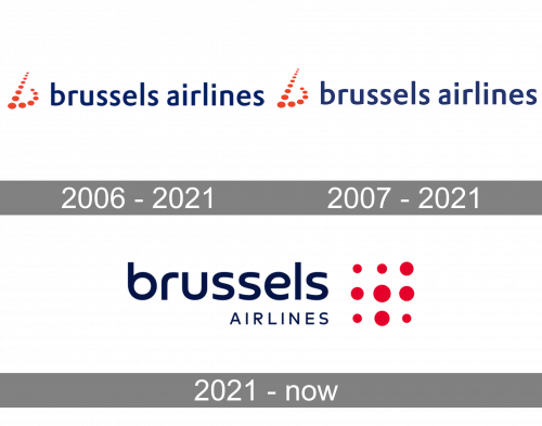
2006 – 2021
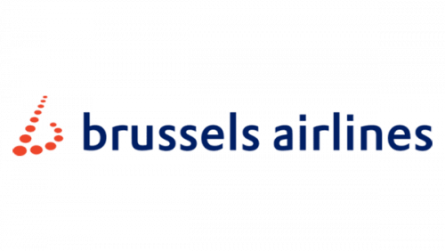
The classic BA logo used a somewhat linear sans-serif style for its wordmark. The letters were exclusively small, even in ‘Brussels’. The coloring was usually dark blue, in this version at least. There’s also an emblem usually put to the left of the logo. It’s an array of orange dots that make up the letter ‘b’ (for ‘Brussels’), but with perspective.
2007 – 2021
That’s another version of the main logo, and the only difference was the paler shade of blue used in the letters.
2021 – Today
The current Brussels Airlines logo features the lowercase letter “b” made up of 14 dots. Originally, the “b” was made up of 13 dots. This logo was often criticized as the number “13” is regarded as an unlucky number in the majority of western countries.
So the company faced the following choice: either to get rid of one dot or add a dot. The problem with the number “12” was that it has religious connotations (12 apostles), while Brussels Airlines wanted to stay religiously neutral.
Font and Color
The progressive lowercase lettering from the primary badge of Brussels Airlines is set in a bold sans-serif typeface with smooth lines and straight cuts of the bars. The closest typefaces to the one, used in this insignia, are, probably, Croogla 4F or Madurai Medium, with some minor modifications.
As for the color palette of the Brussels Airlines visual identity, it is based on two deep and sleek shades of blue and red, a timeless combination, which symbolized air and sun, sky and freedom, professionalism and precision.


