 British Midland International Logo PNG
While British Midland International has ceased operation, the history of the BMI logo contains interesting material for research as it reflects the evolution of logo design since the 1950s.
Brand Overview
BMI was headquartered in Donington Hall in Castle Donington, UK, while its operational base was located at London Heathrow Airport. At its peak, the airline operated over 2,000 flights a week.
Meaning and history
British Midland International had quality a long history. Established in the end of the 1930s as Air School Limited, which founded Derby Aviation Limited in 1946. Already in the late 1940s, the company was operating charter and cargo flights, as well as aircraft maintenance.
In 1964 the company was renamed British Midland Airways, and stayed under this name until 2001, when airlines was rebranded into BMI British Midland. The name “British Midland International” was adopted in 2010, and was used by the company for only two years, as already in 2012 it stopped existing, being merged into British Airways.
What is British Midland International?
British Midland International is the name of a former air carrier from the United Kingdom, which was established in 1938 under the name Air Schools Limited, and merged into British Airways in 2012. The company was a member of a star Alliance, had a fleet of 27 aircraft, and operated flights to 35 international destinations.
1956
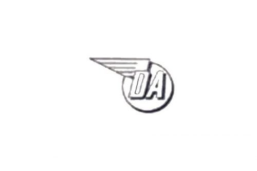
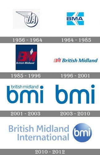
While the company’s roots can be traced back to 1938, it was officially founded in 1946 as Derby Aviation Limited. The earliest-known logo appeared in 1956 when the airline started international services to Ostend, Belgium.
The centerpiece of the 1956 logo was a pair of letters, the “D” and “A,” the initials of “Derby Aviation.” A stylized wing could be seen above the “D.” The wing was extended beyond the circle in which the abbreviation “DA” was placed. The type was italicized.
When the company was renamed Derby Airways about three years later, there was no need for a new logo as the initials remained unchanged.
1964
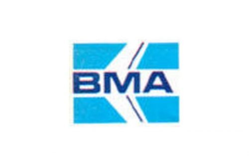
After the company changed its name to British Midland Airways (BMA), it adopted a new logo. It featured a stylized aircraft in flight over the sky-blue background. The central part of the aircraft was formed by a stripe housing the lettering “BMA” in dark blue. The type looked very much like the Microgramma font.
1985
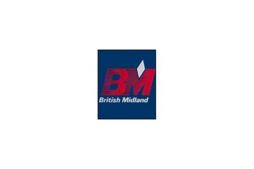
The airline shortened its name to British Midland (BM) and introduced a completely different emblem. It was now dominated by the letters “BM” formed by horizontal stripes, which made them somewhat similar to the IBM logo. The glyphs were italicized and red, which made the resemblance not so apparent. Also, the pattern was of a more dynamic quality due to the difference in the color density (the density was growing from the left to the right).
The top of the “M” contained a tilted white rhombus. Below the abbreviation, the full name of the airline in Univers Bold Italic could be seen. Similar to the letters above, it was also italicized, which reinforced the implied motion. The background was dark blue.
Although there was a lot of implied motion, this logo looked pretty heavy because of the bold letters, dark colors, and abundance of details.
1996
The introduction of the new logo was a natural part of the fleet renewal program the company carried out in 1996.
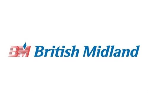
The updated version was by far lighter than its predecessor, and it was now easier to identify the company it belonged to. The emblem was dominated by the full name of the airline, while the “BM” mark grew smaller and moved to the left. While the monogram still featured the old shape and color, the heavy dark blue background disappeared.
While the diagonal serifs on some of the letters in the word “British Midland” introduced upward motion, it did not seem to fit the direction of the serifs on the “B” and “M,” while the angle at which the letters were positioned also differed from the angle at which the serifs were positioned. All these created a slightly cluttered effect, so it was difficult to perceive the logo as a single whole.
2001
The company was rebranded as BMI British Midland and went through one more update of the visual brand identity.
Now the BMI logo was by far simpler. Both the abbreviation “BMI” and the lettering “British Midland” above featured a rounded, streamlined sans serif where many of the sharp elements and angles had been removed or replaced by curves.
The distinctive “D’s” created an illusion of upward motion.
The logo was developed by the US-based brand consultancy Landor Associate. The company stated that the new brand identity: “is now based around the Brand Driver ‘speed with charm and style’.”
2003
When the company’s name was shortened to BMI, the lettering “British Midland” disappeared from the logo.
2010
The company started to use the full name hoping the words “British” and “International” would help to win the markets where the airline is relatively unknown. As a result, the British Midland International logo grew more cluttered.
The abbreviation, which was now white and more rounded, moved into a blue 3D circle. The full name was added to the left. The type it featured was somewhat similar to the one used for “BMI” but was not exactly the same. This was hardly a beneficial approach in terms of the integrity of the image.
While the light blue color supported the sky (and thus aviation) theme, it was a little too transparent to be perfectly legible.
Two years after this logo was introduced, BMI was sold to IAG.
Font and Color
The smooth yet stable title case lettering from the last badge of British Midland International airlines was set in a fancy sans-serif font with softened ends of the bars. The closest fonts to the one, used in this insignia, are, probably, Adora Compact Pro Medium, or Anago Medium, but with the ends of the lines slightly rounded.
As for the color palette of the British Midland International visual identity, it is based on two shades of blue and white, the combination, which is mostly associated with air, sky, and freedom. Blue is also a color of security and reliability, the really important qualities for any airline.


