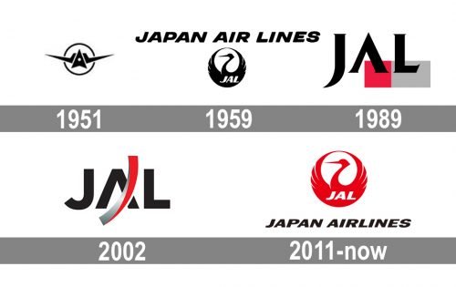
The Japan Airlines logo has gone through several complete overhauls since the airline was founded in 1951.
Meaning and history
Japan Airlines, also known as JAL, is the national airline and flagship carrier of Japan. One of the largest airlines in Asia. It owns a huge modern fleet and is a customer of its flagship aircraft, the Boeing 787 Dreamliner. It is a current member of Oneworld, the second largest aviation alliance.
The company’s main hubs are based at Narita and Haneda airports in Tokyo, with additional hubs at Itami and Kansai airports in Osaka. Japan Airlines serves several domestic and international destinations in Asia, America, Europe, and Oceania.
Japan Airlines has a total of more than 60 domestic routes covering almost the whole of Japan. Flights to Great Britain, Germany, Greece, France, and Finland prevail in the European direction, and Asia – to South Korea, Taiwan, Thailand, Malaysia, and China; in addition, the company performs flights to Australia, the USA, Canada, and other countries.
What is Japan Airlines?
Japan Airlines is the second-largest air carrier in Japan, which was established in 1951, and is based in Tokyo. The airline has a fleet of 155 planes with flights to more than 90 destinations worldwide. Japan Airlines has two main hubs in Tokyo: Haneda and Narita.
1951
The original design featured a stylized aircraft (as seen from behind) flying towards a circle (apparently, the sun).
The very first Japan Airlines logo, designed for the company in 1951, featured a very modern sharp badge in black and white, with the stylized airplane inscribed into a thin circular frame. The plane has its triangular wings elongated and pointed, crossing the thin framing. There was no additional lettering on this version of the logo.
1959
The circle was the only element borrowed from the previous logo. It now housed a stylized bird. The lettering “Japan Air Lines” could be seen above.
The redesign of 1959 has changed everything but the circular shape of the Japan Airlines badge. The new roundel was stylized as a black bird with its wings arched up, making up a ring. The bottom, solid black, part of the bird was decorated by a bold white “JAL” abbreviation in an italicized sans-serif font, while the complete logotype was written above the graphical part in black capitalized letters in the same style.
1989
The abbreviation “JAL” in black over a red square and a gray rectangle.
In 1989 the Japan Airlines logo gets another redesign. The new concept was based on a geometric emblem and a stylized serif abbreviation overlapping it. The emblem boasted a horizontally oriented rectangle, formed by a solid red square followed by a gray rectangle. As for the inscription, it was set in the uppercase of an extra-bold font with sharp triangular serifs and the horizontal bar of the “A” removed.
2002
The abbreviation “JAL” in a slightly different type with a dynamic curve placed over the “A.”
The redesign of 2002 introduced a modern and minimalistic badge for Japan Airlines, which stayed with the air carrier for almost ten years. It was a bold black JAL lettering in a modern and heavy sans-serif typeface with the horizontal bar of the “A” missing. The inscription was crossed by a three-dimensional vertical arched stroke in silver and red gradients.
2011
The company returns to its iconic 1959 logo with just a couple of minor modifications.
In 2011 the Japanese air carrier decided to come back to its bird logo, introduced in 1959, but changed its color palette and refined its contours. The bird is now set in red and placed above a black italicized lettering in a bold sans-serif typeface with softened contours of the uppercase characters.
Font
The bold italicized logotype from the primary badge of the Japan Airlines company is set in a heavy yet elegant and modern sans-serif typeface with stable uppercase letters. The closest font to the one, used for this insignia is, probably, Metronic Pro Wide Extenso Ultra, but with some contours modified.
Color
As for the color palette of Japan Airlines’ visual identity, it is based on a combination of red, black, and white, which represents the power and confidence of the company, and shows its value to the customers and their comfort and safety.


