Bravo is one of the popular American cable tv-channels, established in 1980 by Rainbow Media and acquired by NBCUniversal, one of the leading media and entertainment companies engaged in the development, production, and distribution of entertainment, news, and information programs worldwide.
Meaning and history
Bravo is an American pay television channel that began operations in 1980 and has been owned by NBCUniversal since 2002. Initially, Bravo focused on art and movie programs, but later the channel was forced to change the concept in order not to go bankrupt. After that, the airwaves became more oriented towards mass culture: a large number of popular reality shows and a lot of commercials appeared.
The main project of Bravo is the program “Real Housewives”, which was produced in different regions of the United States: New York, Atlanta, Dallas, and others.
The “Real Housewives” is an American media franchise consisting of several reality shows about the lives of wealthy housewives living in different regions across the United States.
The first show in the series, The Real Housewives of Orange County, launched on Bravo on March 21, 2006. The success of the first show led to several spin-offs, with storylines in New York City and Atlanta in 2008; New Jersey in 2009, Washington, D.C., and Beverly Hills in 2010; and Miami in 2011. Today, The Real Housewives airs in 11 cities across the United States.
The Real Housewives franchise is extremely popular on Bravo due to its perfect blend of humor and drama.
What is Bravo?
Bravo is an American pay television channel, whose content is based on reality shows. The most popular project on Bravo is the “Real Housewives”, which shows the life of American women from the upper class and is watched all over the world.
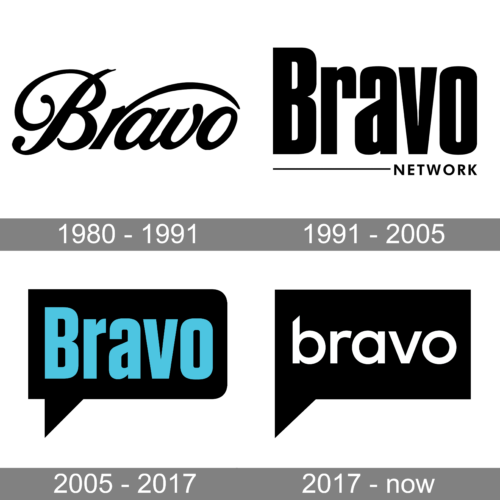
In terms of visual identity, Bravo is very laconic yet looks stylish and progressive. Throughout the years, the logo of the TV channel was changed several times, but the current concept was first introduced in 2005.
1980 – 1991
The original Bravo logo, designed in 1980, was someone significantly different from the minimalistic badge we can see today. The insignia was based on a fancy italicized lettering in a custom cursive font, with an elongated bar of the “R”, arched above the three right letters of the wordmark. It was a black logotype on a white background, which looked very elegant and was aimed to represent the initial idea of the TV channel, art.
1991 – 2005
In 1991 the Bravo logo was redesigned in a more laconic and modern way. Even though, it was still a black logotype on a white background, the mood and style of the inscription changed dramatically. Now it was a title case lettering in a bold narrowed sans-serif typeface, which was Compacta. The wordmark was underlined by a thin black line with the “Network” in small capitals on its right.
2005 – 2017
After becoming a part of the NBCUniversal group, Bravo went through another redesign. The lettering from the previous badge was slightly modified and was now written in bright blue letters on a rectangular dialogue plate, with rounded angles on the right and sharp ones on the left. This was a more playful and modern version of the Bravo logo, which stayed with the TV channel for a decade.
2017 – Today
In February 2017 Bravo introduced its new logo, created by Sibling Rivalry Studio Loyalkaspar. The wordmark was rewritten in lowercase, with the typeface changed to a thinner and more rounded one. Now the inscription is set in white on a black background, making up a string eye-catching contrast.
Font and color
The bold lowercase lettering from the Bravo logo is set in a modern sans-serif font with quite simple shapes of the characters, and just one unique element — the diagonal cut of the vertical bar of the “B”. The font used in this insignia is Circular.
As for the color palette of the Bravo visual identity, it is as laconic as the composition of the logo in general — black and white. This scheme makes the logo of the TV channel visible and confident on any background.


