Borderlands is an exhilarating first-person shooter video game series known for its vibrant, comic book-style graphics and robust loot system. Created by Gearbox Software, it was initially released. The game combines shooting, role-playing elements, and humor, set in the chaotic world of Pandora. Players embark on quests, collect diverse weapons, and engage in cooperative gameplay. Developed in the United States, Borderlands appeals to gamers seeking adventure, strategy, and camaraderie in a post-apocalyptic setting.
Meaning and history
The saga of Borderlands, crafted by Gearbox Software, embarked in 2009, revolutionizing the FPS genre with its unique blend of vivid, comic-inspired aesthetics, expansive loot systems, and a gripping narrative set on the untamed planet of Pandora.
This franchise has unfolded across several main titles and spin-offs, each enriching the lore and gameplay. Notably, it harmonizes RPG elements with intense combat, fostering both solo and cooperative experiences. Gearbox, based in the U.S., has nurtured Borderlands into a cultural icon, blending humor, endless customization, and engaging story arcs, captivating a global audience.
This journey has also seen collaborations, expanding the universe beyond games into comics and potential film adaptations, illustrating its broad appeal and impact on entertainment.
What is Borderlands?
Borderlands merges the thrill of first-person shooters with the depth of role-playing games, set against the backdrop of Pandora, a planet teeming with chaos and treasure. Created by Gearbox Software, it stands out for its distinctive, vibrant art style and a loot-driven gameplay that offers an array of weapons, making each playthrough uniquely captivating.
2009
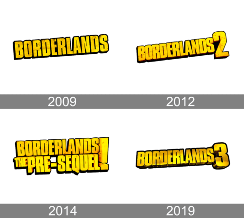
The logo for Borderlands bursts forth with a gritty, distressed look, its letters rugged and irregular, mirroring the game’s chaotic, lawless setting. Splashes of yellow against a white background convey a wild, untamed energy. The typeface, reminiscent of stencil art, suggests rebellion and survival, key themes of the Borderlands universe. Its boldness grabs attention, much like the game’s daring adventures seize a player’s focus.
2012
The “Borderlands 2” logo evolves from its predecessor with a pronounced “2”, asserting its sequel status with confidence. This numeral’s bold, golden hue and cracked texture reflect the game’s evolution and heightened intensity. The wear and tear on the logo’s edges capture the series’ signature ruggedness, and the shadowing behind the “2” adds a three-dimensional effect, hinting at the game’s deepened narrative and expanded world. The logo’s continuity maintains brand recognition while promising an amplified experience.
2014
The logo of “Borderlands: The Pre-Sequel” introduces a new element with the tagline “The Pre-Sequel”, stacked beneath “Borderlands”, showcasing the game’s intermediary narrative. The typeface retains the iconic yellow-on-black scheme but is now infused with more pronounced wear, signifying the rougher edges of the game’s storyline. The addition distinctly positions the game within the timeline, providing a visual cue of its place between the original and its sequel, evoking curiosity about the untold chapter of the Borderlands saga.
2019
In the “Borderlands 3” logo, the most striking addition is the bold “3” that anchors the design, signaling the third main installment. The number shines with a fiery gradient, from deep orange to yellow, suggesting a new dawn or explosive action within the game. The background maintains the series’ signature gritty texture, while the font’s hefty form and shadowing effect add a sense of depth and dimensionality. This evolution hints at both a continuation and an escalation of the Borderlands saga’s wild, loot-filled adventures.


