One of the world’s most popular fighting games, Tekken was created by Bandai Namco Studios and launched by Bandai Namco Entertainment. In addition to several video and arcade games, the franchise comprises film and print adaptations.
Meaning and history
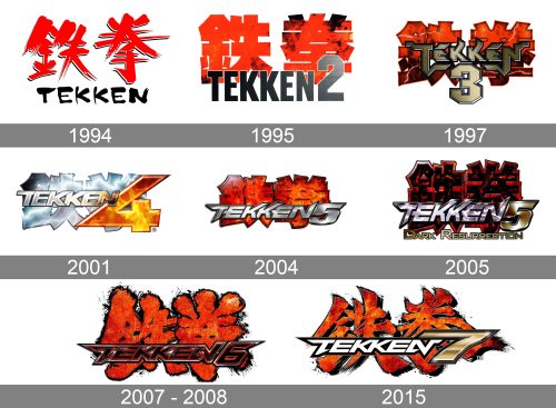
The logo of the original game set the standard for the following logotypes. The design showcased the name of the game in English paired with the Japanese version.
The first game was released in 1994, succeeded by Tekken 2 in August 1995. The series proved very successful, so new releases were introduced on a regular basis.
1994 (Tekken)
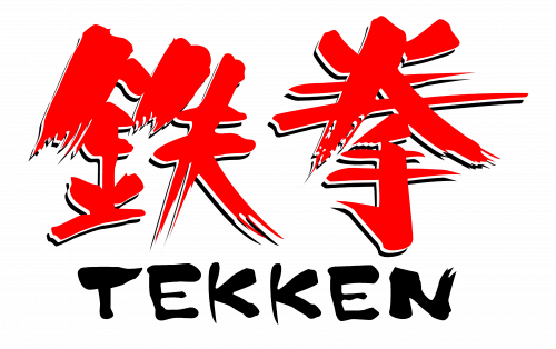
The way the Tekken logo looked slightly varied depending on the release. For instance, on the cover of the North American PlayStation version, the two wordmarks were positioned one above the other. The Japanese one was on the top. It was given in red. The combination of casual strokes and red color gave an impression that the hieroglyphs had been scribbled in blood.
The English version, which was placed below, was black and also featured casual strokes imitating something written by hand (maybe even with a finger). It was perfectly legible, though.
What is Tekken
The Tekken franchise is based on a series of video and arcade games but is also known for the namesake films (animated and live-action), as well as print versions. The creator of the game is Japanese designer Seiichi Ishii.
Other releases featured a slightly different wordmark, where the English name was red or dark brown and more prominent. As there was no Japanese version, it was the English one that had that scribbled-in-blood effect.
1995 (Tekken 2)
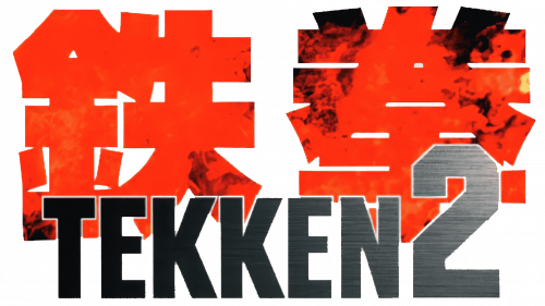
This one completely lost the casual and bloody effects of its predecessor. The Japanese hieroglyphs were still red, but they looked regular. The English version was at the forefront and was set in a generic sans. It was dark gray or silvery, which didn’t have the drama of the previous design.
In the logo of Tekken 2 ver. B, there was also the lettering “Ver. B” in yellow and bright red. It featured an italicized script.
1997 (Tekken 3)
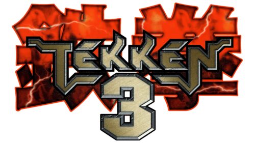
The Tekken logo became fiery. The surface of the Japanese version imitated the colors of the flame rather realistically. The letters of the English wordmark seemed to be made of metal. There was a fresh-from-the-smithy effect about them.
2001 (Tekken 4)
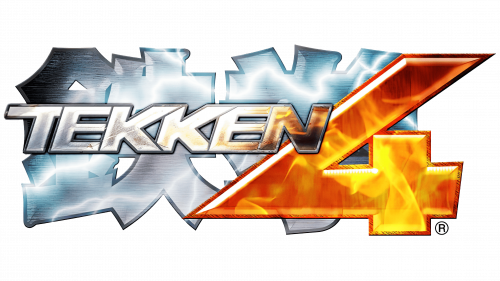
The temperature plummeted leaving the Japanese version cool and silvery. The English one now featured a better legible sans serif type, where the letters partly overlapped. Only the yellowish and amber tones of the figure “4” reminded us of the scorching heat of the previous version.
2004 (Tekken 5)
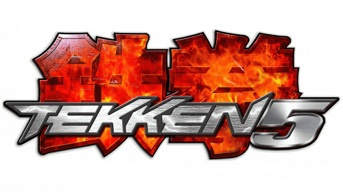
Once again, the fiery theme became more prominent. The hieroglyphs were burning again, dominated by the red and dark orange shades. The English word was silvery, again with the familiar smithy feel.
2005 (Tekken: Dark Resurrection)
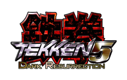
While the previous version was burning, this one seemed to have been almost burnt. At least the hieroglyphs looked pretty much like coal with only the edges touched by the flame. The silvery surface of the English wordmark had a liquid feel.
2007 – 2008 (Tekken 6)
The logo went through a complete overhaul. The hieroglyphs now had an unusual effect that can be described as liquid fire. The English version looked darker than before.
2015 (Tekken 7)
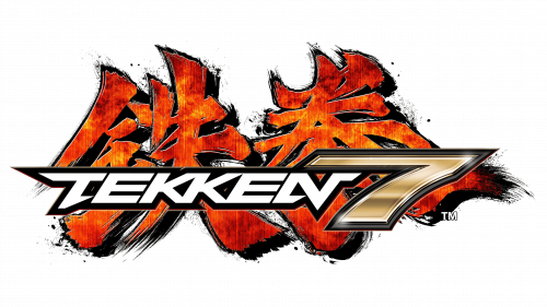
While the “liquid fire” pattern was still there, the strokes lost their rounded ends. They now had a sharp, edgy feel. The English wordmark was white, while the figure “7” was gold with a gradient.
Colors and font
The Tekken logo has always been dominated by red and silver. It has been based on a custom artwork rather than an existing font.


