The range of services available through the Bolt app includes vehicles for hire, micromobility, car-sharing, and food delivery services. The company is headquartered in Tallinn, Estonia, and works in more than 40 countries. The company was established in 2013 under the name mTakso. Its founder was a high-school student Markus Villig, who was 19 back then. Soon, the service was renamed Taxify.
Meaning and history
While the Bold logo is just the name of the brand, it does have a meaningful pictorial element.
What is Bolt?
Bolt is an Estonia-based transportation network company known for its app, which enables customers to hail a taxi, rent cars or electric scooters, as well as e-bikes from their smartphones. The app also gives a chance to order food delivery.
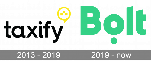
2013 – 2019 (Taxify)
The location icon was moved to the upper right-hand angle of the logo. Also, it looked more like a speech bubble than a location icon now. Both these interpretations were valuable for the brand.
2019 – present (Bolt)
The Bolt logo seems to have nothing in common with that of its predecessors, at least at first glance.
The bright green color, which is now used for all the elements of the design, creates a more vivid impression. The type is by far bolder, which makes the wordmark easier to read even at a smaller size. The initial is now capitalized, while all the other letters remain lowercase.
What connects the two emblems is that the type is minimalist and highly legible. What’s more, both have almost no dynamic elements (swooshes, italics, for instance), which is a remarkable fact – the specialization of the brands suggests the need for some speed in the logo. Only the circles have a slight “motion” effect (as the symbol of the wheel).
Interestingly, a pronounced circle theme is present in both the visual identities. In the Taxify logo, it comes in the form of the taxi/speech bubble in the upper right-hand corner, whereas in the case of Bolt, the circle comes right below the “o,” which is also a circle and emphasizes this theme.
The obvious interpretations, as we’ve mentioned above, are the location icon and speech bubble. If we go deeper, we should remember that some of the most obvious connotations of the circle shape are community and social aspects of life – hence “circle of friends” or “social circle.” It’s also about protection and the ability to compromise, unlike angular shapes, which are more about assertiveness and may symbolize “angles” in relationships. These connotations seem positive for a company that provides services for multiple customers.
Colors and font
In contrast with the “warning” black-and-yellow palette (the colors of wasps) of the original mTakso and Taxify logos, green is more relaxing, as it is most commonly associated with nature, being in the forest or on the meadow.
What has been the reason behind the update of the palette?
We should take into consideration the risk inherent to using a vehicle (especially the one you’re not familiar with) or eating food prepared not at home. No matter how small it is, this risk is still there, so using the palette that emphasizes the “danger” message doesn’t seem to be a wise move.
Green color, conversely, can send the opposite message. In the Bold logo, we can see a rather active tint, which has been necessary to capture the attention of prospective customers. Then again, it isn’t as aggressive and “warning” as the previous color scheme.


