Blue Islands is a prominent airline operating today. Specializing in regional flights, it offers convenient travel options for passengers. The company is owned by Healthspan Group, a well-established British health and wellness brand. Blue Islands operates from its headquarters in the Channel Islands, with its main hub located at Jersey Airport. The airline serves various destinations in the United Kingdom, Europe, and beyond, providing reliable and efficient services to travelers.
Meaning and history
Blue Islands is an airline founded by Derek Coates in 2006. Since its inception, the airline has achieved significant milestones. It operates as an independent regional airline, connecting the Channel Islands with the United Kingdom and Europe. Blue Islands has a modern fleet of aircraft and offers a range of services to passengers, including scheduled flights, charter services, and inter-island services. The airline has successfully expanded its route network and has established partnerships with major airlines, enabling seamless travel connections for its customers. Currently, Blue Islands continues to thrive in the aviation industry, providing reliable and convenient air transportation options while maintaining a strong focus on customer satisfaction and operational excellence.
What is Blue Islands?
Blue Islands is a regional airline based in the Channel Islands, specifically in Guernsey. It operates scheduled services between the Channel Islands and destinations in the United Kingdom and Europe. The airline offers convenient and reliable flights, catering to both leisure and business travelers in the region.
1999 – 2003
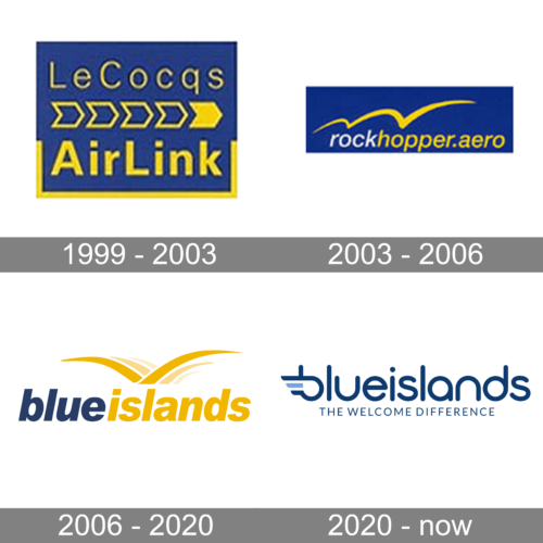
The logo, designed for the air carrier at the end of the 1990s, was composed of a solid blue rectangle with yellow lettering, set in two levels divided by a line of five chevrons, four of white are outlined, and the right one — in solid yellow. The top line of the inscription is set in medium-weight lines, while the bottom level is bold and stable.
2003 – 2006
The redesign of 2003 introduced a blue and yellow badge with the new name of the air carrier. The blue rectangle got flattened and stretched horizontally. The lettering turned white and yellow and got written in the lowercase of an italicized sans-serif, while the top part of the logo featured a yellow wavy stroke, growling bigger to the right.
2006 – 2020
In 2006 the air carrier was renamed Blue Islands. The color palette remained the same, blue and yellow, but the concept of the logo was significantly changed. It was now a bold blue and yellow lettering in the lowercase of a geometric sans-serif typeface, written against a plain white background and accompanied by a yellow emblem, placed above the inscription and depicting a stylized bird.
2020 – Today
The redesign of 2020 has introduced a modern and cool badge for Blue Islands, with the lettering rewritten in a rounded sans-serif font, in blue color. The first lowercase “B” is stylized and has an abstract plane wing in its left part. The lowercase logotype is underlined by a small uppercase “The Welcome Difference” tagline in the same shade of blue.


