Black Sabbath is a legendary rock-band from Great Britain, which was created in 1968 and became a pioneer of heavy-metal. It has numerous prestigious music awards, and is ranked as the Greatest Metal Band by MTV.
Meaning and history
The visual identity of Black Sabbath has been changed many times throughout the years, though it always evokes an evil and dangerous feeling, due to the black color palette and spooky lettering. Among seven emblems, designed for the band, only two are not based on a black and white color palette, though the one, designed in 1975, looks even more diabolic than others.
1969 — 1970
The very first logo for the band was created in 1969 and featured a bold “curly” lettering in white placed on a black background. The thick massive letters of the inscription have thin red details on them, making the color palette darker and the smooth rounded lines of some symbols — stronger.
1971 — 1972
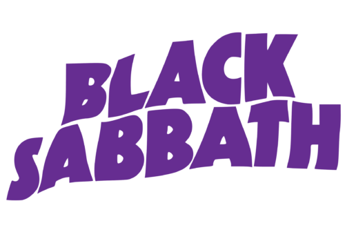
The new logo was introduced in 1971 and was composed of wavy lettering set in two levels, with the inscription in an extra-bold geometric sans-serif typeface. The smooth and massive wordmark looked strong and powerful, reflecting the style of the band’s music and its character.
1972 — 1973

In 1972 the logo is being redrawn again, and now the white logotype in two levels is set in a black background, resembling the very first band’s emblem. The letters on this version and bold and rounded, though their vertical bars feature straight cuts, which adds sharpness and confidence to the whole logo.
1975 — 1976

The version of the emblem, created for Black Sabbath in 1975 boasted a solid black background where the bold red lettering in sans-serif was placed, with the “S” replaced by the stylized as a lightning bolt symbol in white. It was minimalist yet edgy and added a sense of passion to the band’s visual identity.
1989 — 1990
In 1989 Black Sabbath used a gothic-style logotype in monochrome with ornate elegant letters and their lines elongated and curved. All capitals of the wordmark were set in two levels, making the logo balanced and solid.
1992 — 1994
The redesign of 1992 brought a new look to the band’s visual identity, writing its name in one line with the help of a smooth custom typeface, where rounded and sleek letters had their lines elongated and sharpened. Three letters, “B”, “S” and “H” were enlarged to make the lettering look arched. The logo was featured a delicate double underline, which cut the letter “S” in two parts.
2013 — 2017
The logo, introduced by Black Sabbath in 2013, is completely different from all other versions, as executed in thin and clean lines of a white sans-serif typeface. To make it more visible on light backgrounds, the lettering is outlined in gray and features a light and thin shadow in the same color.
The Emblem
The most known element of the Black Sabbath logo is its iconic mascot emblem. The winged figure with horns and the devil tail is called Henry.
Henry was created in 1975 and became an official symbol of the band. He represents the rebellious spirit, as has both angelic and diabolical traits.
It is a very powerful addition to the Black Sabbath visual identity, which is instantly recognizable around the world and reflects all the band’s characteristics and values, as well as celebrates the music genre, the band performs.


