Black Flag has been known as America’s oldest insecticide brand. While the corporate website states it was founded in 1833, other sources mention another year, 1883. In 2011, the brand was acquired by Spectrum Brands.
Meaning and history
The inception of Black Flag traces back to the entrepreneurial spirit of William Burt, who laid the foundation for the company in 1833. From its humble beginnings, Black Flag rapidly ascended to the forefront of the pest control industry, pioneering the development of products that offered both efficacy and safety. Throughout its history, Black Flag has been credited with numerous innovations, including the introduction of the first insecticide spray and the development of chemical compounds that target specific pests without harming the environment.
Over the years, Black Flag has not only expanded its product line but has also grown in terms of its market reach. The company’s main achievements encompass a series of firsts in pest control technologies, contributing significantly to the evolution of pest management solutions. Today, Black Flag is recognized as a leader in the industry, maintaining its position through continuous research and development efforts. The company’s commitment to innovation and quality ensures its products remain at the forefront of the battle against pests, providing reliable and effective solutions for consumers worldwide.
What is Black Flag
Products sold under the Black Flag brand provide tools for insect control. The range has two types of products. Some of them kill insects without any poison, whereas others use insecticide.
1833 – 1925
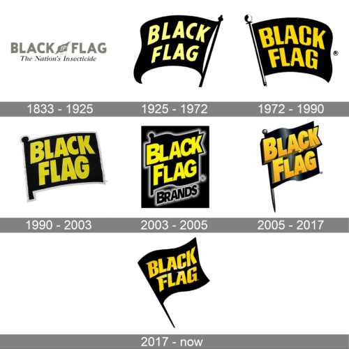
While the insecticide was introduced in 1833 (according to the brand’s website), it’s hard to say when the first real logo was made. One of the earliest examples of the package featured a gray logo. Here, you could see the name of the brand in large sans serif letters. The wordmark looked clean and perfectly legible due to the classic shape of the glyphs. The choice of type was somewhat unusual for the era when beauty was associated with refined and elaborate details and so many logotypes were very cluttered.
However, the overall design wasn’t very clean, too. That partly resulted from the way the flag looked. It was placed between in the middle of the wordmark and had a rather realistically-looking uneven edge. There were characters “IP” inside and the lettering “trademark” below. All this created some visual noise.
As if to make matters worse, a tagline was placed below. It featured an italicized serif typeface, which couldn’t boast the minimalist look of the main wordmark.
1925 – 1972
The design was simplified. The updated logo would have looked modern even in our time. The flag was made larger, which meant that the logo now better worked even in small sizes. Also, the flag was colored black, to better fit the name of the brand.
The light yellow of the wordmark stands out over the black background almost as good as white. And yet, due to this color, the design gets a unique touch impossible for a black-and-white palette.
1972 – 1990
The logo features the name “BLACK FLAG” in bold, capital, and yellow letters against a black, waving flag background. The flag is hoisted on a simple, stylized white pole with a pointed tip, suggesting a traditional flagpole. The overall design is straightforward with a dynamic feel due to the wavy nature of the flag, conveying motion and a sense of urgency, which is appropriate for a company specializing in insect control.
1990 – 2003
The emblem was simplified and grew brighter. The edges of the flag became straight – it was almost a proper square now. The letters became larger and bolder – they now occupied more space.
The yellow of the letters became brighter, more saturated. As a result, the palette lost the refined touch of the previous one. It was more aggressive now.
Also, a gray outline was drawn for the flag, which added some dimension.
2003 – 2005
This logo also displays the “BLACK FLAG” name prominently, but this time, the text takes on a three-dimensional appearance with a metallic sheen, giving it a more modern and industrial look. The flag motif is still present, but it’s now encapsulated within a dark, shield-like emblem that reads “BRANDS” at the bottom in a sans-serif font. This design has a broader corporate identity and a range of products under the Black Flag banner.
2005 – 2017
This design has more depth than the previous one. This partly results from the wave on the flag and partly from the gradient on the flag and the letters. Also, the letters have 3D sides and shades.
Another important update is the addition of a sharp end on the pole holding the flag. This element emphasizes the aggressive nature of the product sold under this brand.
2017 – present
In the image, the design returns to a more simplified approach, with the “BLACK FLAG” text in bold, flat yellow letters on a plain, black flag silhouette. This logo lacks additional embellishments, focusing on clarity and visibility. The simplicity of the design makes it versatile and easily recognizable.


