BHP Billiton is an Australian petroleum company, which was established through the merger of two companies in 2001. It is focused on mining and oil and is one of the largest companies in its segment in the region.
Meaning and history
The BHP Billington visual identity is a reflection of the company’s heritage, showing both of its forming businesses. The wordmark of the logo is accompanied by the brand’s emblem, representing growth and progress.
Before 1985

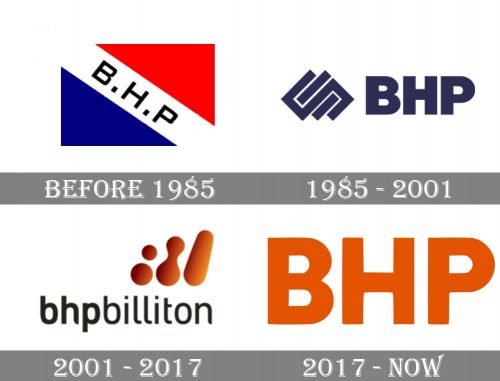
The original BHP logo featured a tricolor rectangular flag, with blue and red parts separated by a thick white diagonal banner with black lettering on it. It was a very simple composition, yet executed very professional and evoking a sense of power and stability.
1985 – 2001

The redesign did 1985 Brough a more minimalist and strict image to the company and now the BHP wordmark was set in the uppercase of a massive a modern sans-serif typeface in dark blue, and placed on the right from a geometric emblem with several overlapping squares and rectangles, resembling a chain-like structure.
2001 – 2017

In 2001 after the merger with Billiton, the logo was redesigned again, and the lettering, which was now set in the lowercase, got extended to “Bhpbilliton”. The graphical part of the redesigned identity was placed above the right part of the inscription and boasted three parts I’m drawn in gradient orange — two dots merged dots and a solid elongated drop.
2017 – Today
The nameplate in all the lowercase lettering is written as one word but separated in two parts due to the different letter thickness. The “BHP” part features bolder lines, while “Billiton” is written in finer and thinner lettering.
The BHP Billiton emblem is a graphical reflection of the company’s evolution, which features three abstract rounded forms, showing the development of the brand — from two separate dots (BHP and Billiton companies) to connected (merger) and, finally to one strong structure.
The bright orange color of the BHP Billiton logo is a celebration of energy and power, which is also friendly and welcoming. It is a very strong visual identity design, a tribute to the brand’s background and heritage, full of meaning and modern design.


